在输入旁对齐表单中的标签

我有非常基本和已知的情况下的形式,我需要对齐标签旁边的输入正确。但是我不知道怎么做。

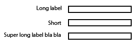
我的目标是将标签与右边的输入对齐。下面是期望结果的图片示例。

enter image description here

为了方便你,我已经做了一把小提琴,并澄清我现在有什么-http://jsfiddle.net/WX58z/

片段:

<div class="block">
<label>Simple label</label>
<input type="text" />
</div>
<div class="block">
<label>Label with more text</label>
<input type="text" />
</div>
<div class="block">
<label>Short</label>
<input type="text" />
</div>

427579 次浏览

警告: 过时答案

现在,您一定要避免使用固定宽度。你可以使用弹性框或 CSS 网格来提出一个响应的解决方案。看看其他答案。


一种可能的解决办法是:

  • 给标签 display: inline-block;
  • 给他们一个固定的宽度
  • 向右对齐文本

那就是:

label {
display: inline-block;
width: 140px;
text-align: right;
}​
<div class="block">
<label>Simple label</label>
<input type="text" />
</div>
<div class="block">
<label>Label with more text</label>
<input type="text" />
</div>
<div class="block">
<label>Short</label>
<input type="text" />
</div>

JSFiddle

我用了类似的东西:

<div class="form-element">
<label for="foo">Long Label</label>
<input type="text" name="foo" id="foo" />
</div>

风格:

.form-element label {
display: inline-block;
width: 150px;
}

在回答这样的问题之前,你可以在这里看看结果:

创建表单以使字段和文本彼此相邻——这样做的语义方式是什么?

因此,为了对小提琴应用相同的规则,你可以使用 display:inline-block并排显示你的标签和输入组,如下所示:

CSS

input {
margin-top: 5px;
margin-bottom: 5px;
display:inline-block;
*display: inline;     /* for IE7*/
zoom:1;              /* for IE7*/
vertical-align:middle;
margin-left:20px
}


label {
display:inline-block;
*display: inline;     /* for IE7*/
zoom:1;              /* for IE7*/
float: left;
padding-top: 5px;
text-align: right;
width: 140px;
}

更新小提琴

您也可以尝试使用 flex-box

<head><style>
body {
color:white;
font-family:arial;
font-size:1.2em;
}
form {
margin:0 auto;
padding:20px;
background:#444;
}
.input-group {
margin-top:10px;
width:60%;
display:flex;
justify-content:space-between;
flex-wrap:wrap;
}
label, input {
flex-basis:100px;
}
</style></head>
<body>


<form>
<div class="wrapper">
<div class="input-group">
<label for="user_name">name:</label>
<input type="text" id="user_name">
</div>
<div class="input-group">
<label for="user_pass">Password:</label>
<input type="password" id="user_pass">
</div>
</div>
</form>


</body>
</html>

虽然这里的解决方案是可行的,但更新的技术已经为我认为是一个更好的解决方案。CSS 网格布局允许我们构建一个更优雅的解决方案。

下面的 CSS 提供了一个由两列组成的“设置”结构,其中第一列应该是右对齐的标签,然后是第二列中的一些内容。通过将其包装在 < div > 中,可以在第二列中显示更复杂的内容。

[作为一个旁注: 我使用 CSS 添加’:’,尾随每个标签,因为这是一个风格元素-我的偏好。]

/* CSS */


div.settings {
display:grid;
grid-template-columns: max-content max-content;
grid-gap:5px;
}
div.settings label       { text-align:right; }
div.settings label:after { content: ":"; }
<!-- HTML -->


<div class="settings">
<label>Label #1</label>
<input type="text" />


<label>Long Label #2</label>
<span>Display content</span>


<label>Label #3</label>
<input type="text" />
</div>

这里是所有表单标签的通用标签宽度。没有固定宽度。

调用具有所有标签的 setLabelWidth 计算器。 此函数将加载 UI 上的所有标签,并找出最大标签宽度。 将下面函数的返回值应用于所有标签。

     this.setLabelWidth = function (labels) {
var d = labels.join('<br>'),
dummyelm = jQuery("#lblWidthCalcHolder"),
width;
dummyelm.empty().html(d);
width = Math.ceil(dummyelm[0].getBoundingClientRect().width);
width = width > 0 ? width + 5: width;
//this.resetLabels(); //to reset labels.
var element = angular.element("#lblWidthCalcHolder")[0];
element.style.visibility = "hidden";
//Removing all the lables from the element as width is calculated and the element is hidden
element.innerHTML = "";
return {
width: width,
validWidth: width !== 0
};


};

我知道这是一个老线程,但是一个更简单的解决方案是在标签中嵌入一个输入,如下所示:

<label>Label one: <input id="input1" type="text"></label>

你可以这样做:

HTML:

<div class='div'>
<label>Something</label>
<input type='text' class='input'/>
<div>

CSS:

.div{
margin-bottom: 10px;
display: grid;
grid-template-columns: 1fr 4fr;
}


.input{
width: 50%;
}

希望这个有用! :)