使滚动条只有在 Div 悬停时才可见?

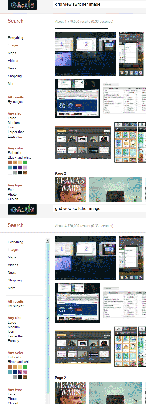
我试图找出如何有一个可滚动的 div,只显示它的滚动条时,徘徊。

例如谷歌图片搜索,在下面的图片,你可以看到如何左侧边栏似乎不能滚动,直到你把鼠标悬停在它上面。

这是否可能与 CSS 或 Javascript 是必需的?如果可能的话,举个简单的例子如何做这样一个任务?

Example

153388 次浏览

div {
height: 100px;
width: 50%;
margin: 0 auto;
overflow: hidden;
}


div:hover {
overflow-y: scroll;
}
<div>
<p>Lorem Ipsum is simply dummy text of the printing and typesetting industry. Lorem Ipsum has been the industry's standard dummy text ever since the 1500s, when an unknown printer took a galley of type and scrambled it to make a type specimen book. It
has survived not only five centuries, but also the leap into electronic typesetting, remaining essentially unchanged. It was popularised in the 1960s with the release of Letraset sheets containing Lorem Ipsum passages, and more recently with desktop
publishing software like Aldus PageMaker including versions of Lorem Ipsum.
</p>
</div>

Would something like that work?

I think something like

$("#leftDiv").mouseover(function(){$(this).css("overflow","scroll");});
$("#leftDiv").mouseout(function(){$(this).css("overflow","hidden");});

Give the div a fixed height and srcoll:hidden; and on hover change the scroll to auto;

#test_scroll{ height:300px; overflow:hidden;}
#test_scroll:hover{overflow-y:auto;}

Here is an example. http://jsfiddle.net/Lywpk/

If you are only concern about showing/hiding, this code would work just fine:

$("#leftDiv").hover(function(){$(this).css("overflow","scroll");},function(){$(this).css("overflow","hidden");});

However, it might modify some elements in your design, in case you are using width=100%, considering that when you hide the scrollbar, it creates a little bit of more room for your width.

The answer with changing overflow have a bunch of issues, like inconsistent width of the inner block and triggering of reflow.

There is an easier way to have the same effect that would not trigger reflow ever: using visibility property and nested blocks:

.scrollbox {
width: 10em;
height: 10em;
overflow: auto;
visibility: hidden;
}


.scrollbox-content,
.scrollbox:hover,
.scrollbox:focus {
visibility: visible;
}


.scrollbox_delayed {
transition: visibility 0.2s;
}


.scrollbox_delayed:hover {
transition: visibility 0s 0.2s;
}
<h2>Hover it</h2>
<div class="scrollbox" tabindex="0">
<div class="scrollbox-content">Hover me! Lorem ipsum dolor sit amet, consectetur adipisicing elit. Facere velit, repellat voluptas ipsa impedit fugiat voluptatibus. Facilis deleniti, nihil voluptate perspiciatis iure adipisci magni, nisi suscipit aliquam, quam, et excepturi! Lorem
ipsum dolor sit amet, consectetur adipisicing elit. Facere velit, repellat voluptas ipsa impedit fugiat voluptatibus. Facilis deleniti, nihil voluptate perspiciatis iure adipisci magni, nisi suscipit aliquam, quam, et excepturi!</div>
</div>


<h2>With delay</h2>
<div class="scrollbox scrollbox_delayed" tabindex="0">
<div class="scrollbox-content">Hover me! Lorem ipsum dolor sit amet, consectetur adipisicing elit. Facere velit, repellat voluptas ipsa impedit fugiat voluptatibus. Facilis deleniti, nihil voluptate perspiciatis iure adipisci magni, nisi suscipit aliquam, quam, et excepturi! Lorem
ipsum dolor sit amet, consectetur adipisicing elit. Facere velit, repellat voluptas ipsa impedit fugiat voluptatibus. Facilis deleniti, nihil voluptate perspiciatis iure adipisci magni, nisi suscipit aliquam, quam, et excepturi!</div>
</div>

Another feature of this method is that visibility is animatable, so we can add a transition to it (see the second example in the pen above). Adding a transition would be better for UX: the scrollbar won't appear immediately when hovered just while moving along to another element, and it would be harder to miss the scrollbar when targeting it with mouse cursor, as it won't hide immediately as well.

One trick for this, for webkit browsers, is to create an invisible scrollbar, and then make it appear on hover. This method does not affect the scrolling area width as the space needed for the scrollbar is already there.

Something like this:

body {
height: 500px;
&::-webkit-scrollbar {
background-color: transparent;
width: 10px;
}
&::-webkit-scrollbar-thumb {
background-color: transparent;
}
}


body:hover {
&::-webkit-scrollbar-thumb {
background-color: black;
}
}


.full-width {
width: 100%;
background: blue;
padding: 30px;
color: white;
}
some content here


<div class="full-width">does not change</div>

This will work:

#div{
max-height:300px;
overflow:hidden;
}
#div:hover{
overflow-y:scroll;
}

Answer by @Calvin Froedge is the shortest answer but have an issue also mentioned by @kizu. Due to inconsistent width of the div the div will flick on hover. To solve this issue add minus margin to the right on hover

#div {
overflow:hidden;
height:whatever px;
}
#div:hover {
overflow-y:scroll;
margin-right: -15px; // adjust according to scrollbar width
}
.div::-webkit-scrollbar-thumb {
background: transparent;
}


.div:hover::-webkit-scrollbar-thumb {
background: red;
}

This will help you to overcome overflow: overlay issues as well.

.div{
height: 300px;
overflow: auto;
visibility: hidden;
}


.div-content,
.div:hover {
visibility: visible;
}
div {
height: 100px;
width: 50%;
margin: 0 auto;
overflow-y: scroll;
}


div:hover > ::-webkit-scrollbar-thumb   {
visibility : visible;
}


::-webkit-scrollbar {
width: 0.5rem;
}


::-webkit-scrollbar-track {
margin-left: 1rem;
}


::-webkit-scrollbar-thumb {
background: var(--dimGrayColor);
border-radius: 1rem;
visibility: hidden;
transition: 0.3s all linear;
}

if You use overflow: hidden property in div and on hover you show overflow-y: scroll then it produce jerk motion in the div so this is the code which is better I figure out to avoid such kind of useless motion.

Since it has not been mentioned yet, a css solution for Firefox, which does not affect the div's size:

div {
overflow-y: scroll;
/* Sets Color to Transparent for both the track and the thumb */
scrollbar-color: transparent transparent;
/* Optional, provides a smooth transition */
transition: scrollbar-color .25s ease-in-out;
}


div:hover {
/* Sets the color back to the default value. You can choose a different color */
scrollbar-color: initial;
}

You can use this with the ::webkit-scrollbar properties (already answered here) for compatibility.

Here's another version of minimal auto-hiding scrollbars without the issues associated with using overflow:hidden;

.minimal-scrollbars{
scrollbar-width: thin;
scrollbar-color: #aaa transparent;
-ms-overflow-style: -ms-autohiding-scrollbar;
}


.minimal-scrollbars::-webkit-scrollbar-track  {
background-color: transparent;
}


.minimal-scrollbars::-webkit-scrollbar{
width: .3em;
}


@media(hover:hover){
.minimal-scrollbars{
scrollbar-color: transparent transparent;
}
.minimal-scrollbars:hover{
scrollbar-color: #aaa transparent;
}
.minimal-scrollbars::-webkit-scrollbar-thumb {
background-color: transparent;
}
.minimal-scrollbars:hover::-webkit-scrollbar-thumb {
background-color: #aaa;
}
}

I used this method

.content {
padding: 17px 0 17px 17px;
width: 300px;
height: 200px;
overflow-y: scroll;
mask-image: linear-gradient(to top, transparent, black),
linear-gradient(to left, transparent 17px, black 17px);
mask-size: 100% 20000px;
mask-position: left bottom;
-webkit-mask-image: linear-gradient(to top, transparent, black),
linear-gradient(to left, transparent 17px, black 17px);
-webkit-mask-size: 100% 20000px;
-webkit-mask-position: left bottom;
transition: mask-position 0.3s, -webkit-mask-position 0.3s;
}


.content:hover {
-webkit-mask-position: left top;
}


@keyframes background {
from {
background: pink;
}
to {
background: #c0d6ff;
}
}


.wrapper {
float: left;
animation: background 5s infinite alternate;
}
<div class="wrapper">
<div class="content">
Lorem Ipsum is simply dummy text of the printing and typesetting industry. Lorem Ipsum has been the industry's standard dummy text ever since the 1500s, when an unknown printer took a galley of type and scrambled it to make a type specimen book. It has survived not only five centuries, but also the leap into electronic typesetting, remaining essentially unchanged. It was popularised in the 1960s with the release of Letraset sheets containing Lorem Ipsum passages, and more recently with desktop publishing software like Aldus PageMaker including versions of Lorem Ipsum.
</div>
</div>

.scroll {
height: 140px;
width: 140px;
overflow-y: auto;
}


.scroll:active::-webkit-scrollbar-thumb,
.scroll:focus::-webkit-scrollbar-thumb,
.scroll:hover::-webkit-scrollbar-thumb {
visibility: visible;
}
.scroll::-webkit-scrollbar-thumb {
background-color: darkgrey;
visibility: hidden;
}


.scroll::-webkit-scrollbar {
width: 4px;
height: 4px;
}
<div class="scroll">
<p>
Lorem ipsum dolor sit amet consectetur adipisicing elit. Reiciendis aliquid recusandae nisi dolore numquam consectetur voluptatibus officia. Velit quod corporis quae quos. Facere, obcaecati? Tenetur obcaecati minima fugit a iste!
</p>
</div>