透明空心或切出圆形
切出一个空心圆是否可以只使用 CSS?
我们都可以这样做:
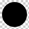
但我们能做到吗?
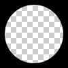
因此,这个问题不是通过在 div上放置一个纯色圆来解决的。
最佳答案