显示地址栏时100vh 的高度-Chrome Mobile

我遇到过这个问题几次,想知道是否有解决这个问题的办法。 我的问题出在 Chrome 手机应用程序上。在那里,您可以向下滚动一点,地址栏消失。到目前为止,一切顺利,让我们举个例子:
容器的 height被设置为 100vh。 < br > < br
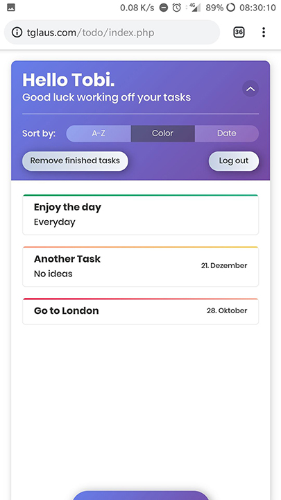
 > How it looks with the address bar

如你所见,底部被切断了。

当我向下滚动时,它看起来像这样:

enter image description here

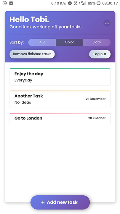
现在看起来不错,显然 Chrome 把地址栏的高度计算成了视窗的高度,所以我的问题是:

有没有办法,它看起来一样,有或没有地址栏?这样容器就会膨胀还是怎样?

79111 次浏览

您可以通过设置高度: 100% 的 html 和 body 标记来修复地址栏问题 偏离航线,将机身边缘和填充设置为零 也可以在主 div 中处理滚动以获得更好的控制

尝试使用 min-height: -webkit-fill-available。您也可以将它添加到 height: 100vh下面作为备用。

根据这个 关于 Chrome 网站的官方文章,在 <html>元素上或者在 position: fixed元素上使用 height: 100%来设置填充可见视窗的高度的正确方法是。正如文档所描述的,这确保了与移动 Safari 的兼容性,并且与 URL 栏的大小无关。

我刚刚想出了一个办法,如何调整元素的大小,使高度不包括屏幕导航栏和浏览器顶部栏的安卓主页按钮无智能手机。如果内容大于屏幕,元素应该增长到能够容纳所有内容的大小,这就是为什么我使用最小高度。


编辑:

使用类添加了一个代码片段,而不是更改 JS 中的样式

// save old window size to adjust only if width changed
let oldWidth = window.innerWidth,
oldHeight = window.innerHeight;
// element to adjust
const target = document.querySelector(".vh100");
// adjust the size if window was resized
window.addEventListener("resize", handleResize);


function handleResize(initial = false) { // the parameter is used for calling the function on page load
/*
* if the width changed then resize
* without this Chrome mobile resizes every time navbar is hidden
*/
if (window.innerWidth !== oldWidth || initial) {
// stretch the target
target.classList.add("setting-100vh");
// save height and apply as min height
const h = target.clientHeight;
target.classList.remove("setting-100vh");
target.style.minHeight = h + "px";
}
}
// call when page is loaded
handleResize(true);
* {
margin: 0;
}


.vh100 {
background-color: green;
}


/*
* Stretch the element to window borders and save the height in JS
*/


.setting-100vh {
position: fixed;
top: 0;
bottom: 0;
min-height: unset;
}
<body>
<header class="vh100">
<h1>100vh on mobile</h1>
</header>
<main>
<p>Lorem ipsum dolor sit amet consectetur adipisicing elit. Possimus ipsa officia mollitia facilis esse cupiditate, nisi recusandae quas id enim alias eaque suscipit voluptates laudantium quasi saepe deserunt labore fuga deleniti placeat, necessitatibus
quibusdam. Quaerat adipisci provident minima laboriosam modi ullam accusamus error dolores iure ducimus laborum similique distinctio temporibus voluptas nulla quod ipsa, nostrum quam cumque id animi unde consectetur incidunt! Dolorem sed quisquam
at cumque. Cumque non nam exercitationem corporis? Minus sed explicabo maiores ipsam ratione. Quam, fugit asperiores nesciunt dolores culpa, numquam blanditiis sint dolorum ex corrupti illo veniam nostrum odio voluptatibus accusantium ullam impedit
eligendi voluptates?</p>
</main>
</body>

我遇到了类似的问题,并在 ReactJS 中使用了这个解决方案:

import { useLayoutEffect, useState } from 'react';


function useWindowSize() {
const [size, setSize] = useState([0, 0]);
useLayoutEffect(() => {
function updateSize() {
setSize([window.innerWidth, window.innerHeight]);
}
window.addEventListener('resize', updateSize);
updateSize();
return () => window.removeEventListener('resize', updateSize);
}, []);
return size;
}

这个 useWindowSize函数取自 使用 React 调整浏览器大小的重新呈现视图

当我在代码中使用它时,它看起来像这样:

const MessageList = () => {
const { messages } = useContext(ChatContext);
const [, windowHeight] = useWindowSize();
return (
<div
className="messages"
style=\{\{
height: windowHeight - 80 - 48, // window - message form - navbar
}}
>
{messages.map((m, i, list) => ( <Message ... /> )}
</div>
);
};

只是想在这里展开一下顶部的答案——我发现正如 Ross Light 上面提到的那样,你需要使用 height: 100%来表示网页浏览器的地址栏。但是,为了实现这一点,你必须设置 html 标签和 body 标签的高度等于 height: 100%,否则你的 div 就不能正常展开:

<!DOCTYPE html>
<html>
<head>


<style>


html, body {
height: 100%;
}


.fillViewport {
height: 100%;
}


.redBackground {
background-color: red;
}


</style>


</head>
<body>


<div class="fillViewport redBackground"></div>


<body>
</html>
.my-element {
height: 100vh; /* Fallback for browsers that do not support Custom Properties */
height: calc(var(--vh, 1vh) * 100);
}

现在让我们用 JavaScript 获得 viewport 的内部高度:

// First we get the viewport height and we multiple it by 1% to get a value for a vh unit
let vh = window.innerHeight * 0.01;
// Then we set the value in the --vh custom property to the root of the document
document.documentElement.style.setProperty('--vh', `${vh}px`);

来源: https://css-tricks.com/the-trick-to-viewport-units-on-mobile/

从开发人员的角度来看,社区对于浏览器应该如何处理顶部、底部和侧面板的移动仍然没有严格的一致意见。

问题中提到的问题是众所周知的:

enter image description here

  1. 一切都是从 苹果网络版开始的。其中一个问题是网站开发人员使用 vh来计算字体大小(calc (100/vh * something))。如果100vv 是动态的,当用户向下滚动并且地址栏被隐藏时,那么字体大小,和其他绑定元素一样,将被扭曲,从而产生非常糟糕的用户体验,更不用说 CPU/GPU 密集型任务了。
    苹果的决定是 以匹配更大的屏幕尺寸(没有地址栏)为100vh 不断。因此,当地址栏显示,您使用 100vh高度的底部部分将走出屏幕。 许多开发人员不同意这个决定,他们认为 viewport 单元是动态的,并且与可见的“ view port”完全相同。

  2. Google Chrome 团队决定成为 与苹果浏览器兼容,并坚持同样的决定。

  3. 在大多数现代浏览器中,height: 100%等于真正可见的部分,也就是说,高度的变化取决于地址栏在滚动过程中是可见的还是隐藏的。

  4. 条形图不仅可以出现在屏幕的顶部,也可以出现在屏幕的底部(现代 iOS) ,而且屏幕上的键盘可以缩短视图。 有一个 样带不错检查在移动设备的实际大小 100vh vs 100%
    enter image description here


解决方案1

html, body { height: 100%; }
.footer-element {
position: fixed;
bottom: 10px;
}

解决方案2
用等于“100vh-100%”的可见条高度补偿对 vh的依赖,当条被隐藏时,差值为0。

html, body { height: 100vh; }
.footer-element {
position: fixed;
bottom: calc(10px + (100vh - 100%));
}