如何删除扑动图标按钮大填充?

我希望有一排 IconButtons,它们彼此挨着,但是在实际的图标和 IconButton 限制之间似乎有相当大的填充。我已经将按钮上的填充设置为0。

这是我的组成部分,非常简单明了:

class ActionButtons extends StatelessWidget {
@override
Widget build(BuildContext context) {
return Container(
color: Colors.lightBlue,
margin: const EdgeInsets.all(0.0),
padding: const EdgeInsets.all(0.0),
child: Row(
mainAxisAlignment: MainAxisAlignment.start,
children: <Widget>[
IconButton(
icon: new Icon(ScanrIcons.reg),
alignment: Alignment.center,
padding: new EdgeInsets.all(0.0),
onPressed: () {},
),
IconButton(
icon: new Icon(Icons.volume_up),
alignment: Alignment.center,
padding: new EdgeInsets.all(0.0),
onPressed: () {},
)
],
),
);
}
}

enter image description here

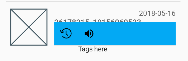
我想摆脱大部分浅蓝色的空间,让我的图标开始在左边较早,并接近对方,但我不能找到方法来调整图标按钮本身。

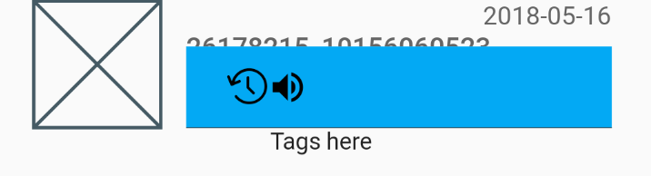
我几乎可以肯定这个空间是由按钮本身占据的,因为如果我把它们的对齐方式改为 centerRightcenterLeft,它们看起来就像这样:

enter image description here

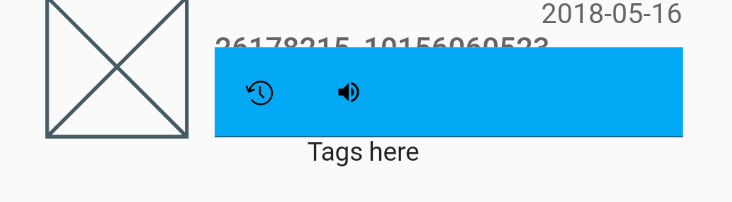
把实际的图标变小也不会有什么帮助,按钮还是很大:

enter image description here

谢谢你的帮助

84097 次浏览

It's not so much that there's a padding there. IconButton is a Material Design widget which follows the spec that tappable objects need to be at least 48px on each side. You can click into the IconButton implementation from any IDEs.

You can also semi-trivially take the icon_button.dart source-code and make your own IconButton that doesn't follow the Material Design specs since the whole file is just composing other widgets and is just 200 lines that are mostly comments.

Two ways to workaround this issue.

Still Use IconButton

Wrap the IconButton inside a Container which has a width.

For example:

Container(
padding: const EdgeInsets.all(0.0),
width: 30.0, // you can adjust the width as you need
child: IconButton(
),
),

Use GestureDetector instead of IconButton

You can also use GestureDetector instead of IconButton, recommended by Shyju Madathil.

GestureDetector( onTap: () {}, child: Icon(Icons.volume_up) )

I was facing a similar issue trying to render an Icon at the location the user touches the screen. Unfortunately, the Icon class wraps your chosen icon in a SizedBox.

Reading a little of the Icon class source it turns out that each Icon can be treated as text:

Widget iconWidget = RichText(
overflow: TextOverflow.visible,
textDirection: textDirection,
text: TextSpan(
text: String.fromCharCode(icon.codePoint),
style: TextStyle(
inherit: false,
color: iconColor,
fontSize: iconSize,
fontFamily: icon.fontFamily,
package: icon.fontPackage,
),
),
);

So, for instance, if I want to render Icons.details to indicate where my user just pointed, without any margin, I can do something like this:

Widget _pointer = Text(
String.fromCharCode(Icons.details.codePoint),
style: TextStyle(
fontFamily: Icons.details.fontFamily,
package: Icons.details.fontPackage,
fontSize: 24.0,
color: Colors.black
),
);

Dart/Flutter source code is remarkably approachable, I highly recommend digging in a little!

To show splash effect (ripple), use InkResponse:

InkResponse(
Icon(Icons.volume_up),
onTap: ...,
)

If needed, change icons size or add padding:

InkResponse(
child: Padding(
padding: ...,
child: Icon(Icons.volume_up, size: ...),
),
onTap: ...,
)

Wrapping the IconButton in a container simply wont work, instead use ClipRRect and add a material Widget with an Inkwell, just make sure to give the ClipRRect widget enough border Radius 😉.

ClipRRect(
borderRadius: BorderRadius.circular(50),
child : Material(
child : InkWell(
child : Padding(
padding : const EdgeInsets.all(5),
child : Icon(
Icons.favorite_border,
),
),
onTap : () {},
),
),
)

A better solution is to use Transform.scale like this:

 Transform.scale(
scale: 0.5, // set your value here
child: IconButton(icon: Icon(Icons.smartphone), onPressed: () {}),
)

Instead of removing a padding around an IconButton you could simply use an Icon and wrap it with a GestureDetector or InkWell as

GestureDetector(
ontap:(){}
child:Icon(...)
);

Incase you want the ripple/Ink splash effect as the IconButton provides on click wrap it with an InkWell

InkWell(
splashColor: Colors.red,
child:Icon(...)
ontap:(){}
)

though the Ink thrown on the Icon in second approach wont be so accurate as for the IconButton, you may need to do some custom implementation for that.

Here's a solution to get rid of any extra padding, using InkWell in place of IconButton:

Widget backButtonContainer = InkWell(
child: Container(
child: const Icon(
Icons.arrow_upward,
color: Colors.white,
size: 35.0,
),
),
onTap: () {
Navigator.of(_context).pop();
});

Simply pass an empty BoxConstrains to the constraints property and a padding of zero.

IconButton(
padding: EdgeInsets.zero,
constraints: BoxConstraints(),
)

You have to pass the empty constrains because, by default, the IconButton widget assumes a minimum size of 48px.

You can use ListTile it gives you a default space between text and Icons that would fit your needs

ListTile(
leading: Icon(Icons.add), //Here Is The Icon You Want To Use
title: Text('GFG title',textScaleFactor: 1.5,), //Here Is The Text Also
trailing: Icon(Icons.done),
),