最佳答案
无法更改文本字段边框颜色
我试图改变颜色的边界我的 TextField使用 BorderSide,但它不工作。
这是我下面的代码。
new TextField(
decoration: new InputDecoration(
border: new OutlineInputBorder(
borderSide: new BorderSide(color: Colors.teal)
),
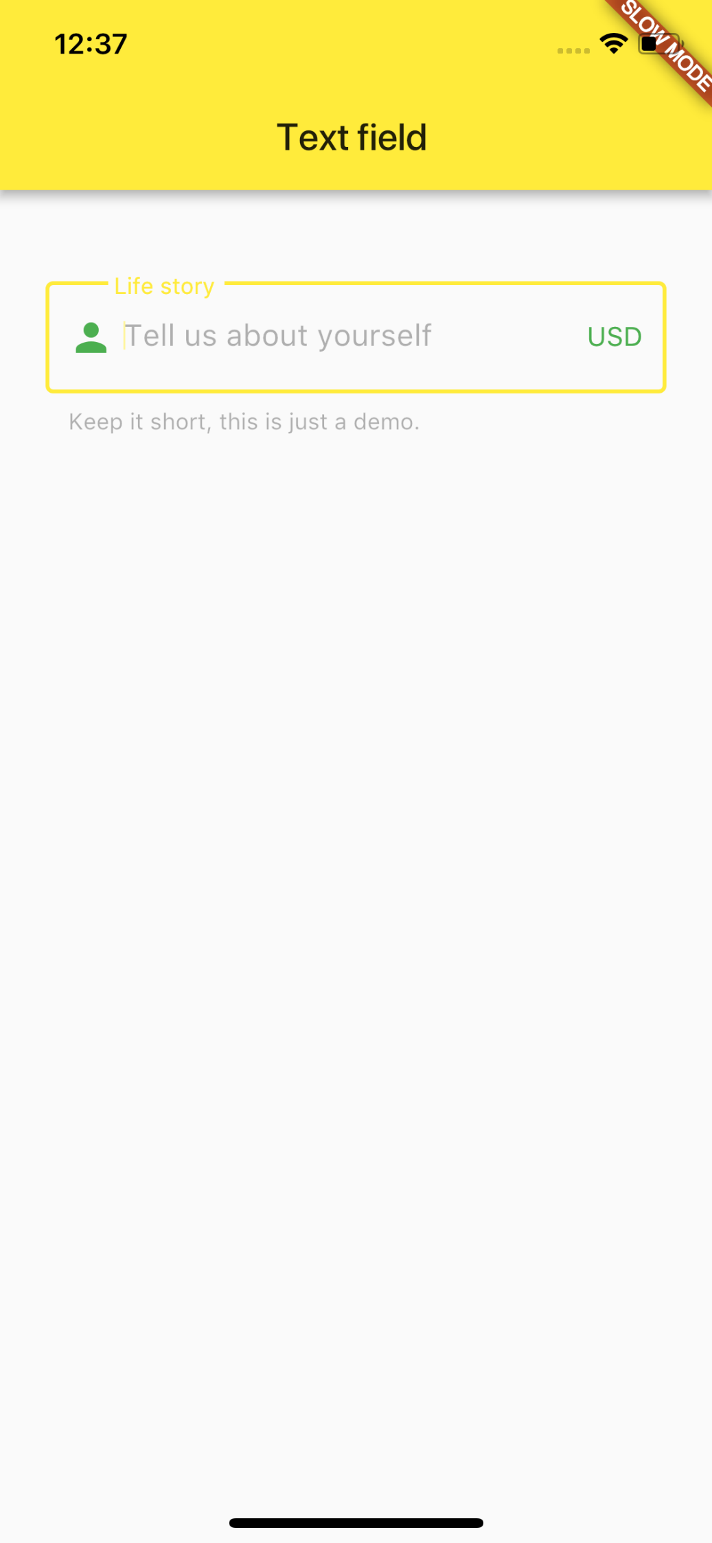
hintText: 'Tell us about yourself',
helperText: 'Keep it short, this is just a demo.',
labelText: 'Life story',
prefixIcon: const Icon(Icons.person, color: Colors.green,),
prefixText: ' ',
suffixText: 'USD',
suffixStyle: const TextStyle(color: Colors.green)),
)
)
结果的屏幕截图如下所示。