添加波纹效果,我的按钮与按钮背景颜色?

我创建了一个按钮,我想添加涟漪效应的按钮!

我创建了一个按钮 bg XML 文件: (bg _ btn.XML)

<shape xmlns:android="http://schemas.android.com/apk/res/android" android:shape="rectangle">
<gradient android:startColor="#FFFFFF" android:endColor="#00FF00" android:angle="270" />
<corners android:radius="3dp" />
<stroke android:width="5px" android:color="#000000" />
</shape>

这就是我的涟漪效应文件:

<ripple xmlns:android="http://schemas.android.com/apk/res/android"
xmlns:tools="http://schemas.android.com/tools"
android:color="#f816a463"
tools:targetApi="lollipop">
<item android:id="@android:id/mask">
<shape android:shape="rectangle">
<solid android:color="#f816a463" />
</shape>
</item>
</ripple>

这是我的按钮,我想添加涟漪效应:

<Button
android:layout_width="wrap_content"
android:layout_height="wrap_content"
android:text="New Button"
android:id="@+id/button"
android:layout_centerHorizontal="true"
android:layout_marginTop="173dp"
android:textColor="#fff"
android:background="@drawable/ripple_bg"
android:clickable="true" />

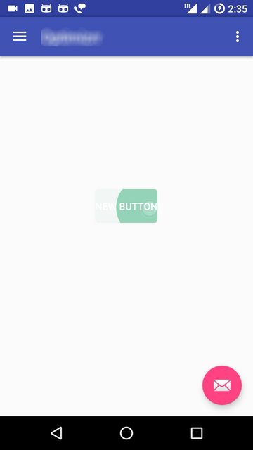
但是增加波纹效果后按钮背景是透明的,按钮只有在点击时才显示, 像这样:

点击之前

点击

但我需要按钮的背景颜色和涟漪效果, 我在 Stack Overflow 的不同博客中找到了一些这样的代码,但是仍然不能工作!

197231 次浏览

给 Android 按钮添加涟漪效果/动画

只需将按钮背景属性替换为 Android: background =”? attr/selectableItemBackground”,代码如下所示。

      <Button
android:layout_width="match_parent"
android:layout_height="wrap_content"
android:background="?attr/selectableItemBackground"
android:text="New Button" />

给 Android 按钮添加涟漪效果/动画的另一种方法

使用这种方法,您可以自定义涟漪效果的颜色。首先,必须在可绘制的资源目录中创建 xml 文件。创建涟漪 _ effect.xml 文件并添加以下代码。 Res/draable/涟漪 _ effect. xml

<?xml version="1.0" encoding="utf-8"?>
<ripple xmlns:android="http://schemas.android.com/apk/res/android"
xmlns:tools="http://schemas.android.com/tools"
android:color="#f816a463"
tools:targetApi="lollipop">
<item android:id="@android:id/mask">
<shape android:shape="rectangle">
<solid android:color="#f816a463" />
</shape>
</item>
</ripple>

并将按钮的背景设置为上面的可绘制资源文件

<Button
android:layout_width="match_parent"
android:layout_height="wrap_content"
android:background="@drawable/ripple_effect"
android:padding="16dp"
android:text="New Button" />

当你使用 android: back 时,你正在用一种空白颜色代替大部分按钮的样式和外观。

更新: 在 AppCompat 的23.0.0版本中,出现了一个新的 Widget。AppCompat.一种彩色样式,它使用主题的 color ButtonNormal 表示禁用的颜色,使用 color Accent 表示启用的颜色。

这允许您应用它到您的按钮直接通过

<Button
...
style="@style/Widget.AppCompat.Button.Colored" />

您可以在 v21目录中使用一个可绘制的背景,例如:

<?xml version="1.0" encoding="utf-8"?>
<ripple xmlns:android="http://schemas.android.com/apk/res/android"
android:color="?attr/colorControlHighlight">
<item android:drawable="?attr/colorPrimary"/>
</ripple>

这将确保您的背景颜色是?Attr/color 质点,并使用默认的涟漪动画默认?Attr/color ControlHighlight (如果愿意,也可以在主题中设置)。

注意: 您必须为小于 v21的版本创建一个自定义选择器:

<?xml version="1.0" encoding="utf-8"?>
<selector xmlns:android="http://schemas.android.com/apk/res/android">
<item android:drawable="@color/primaryPressed"            android:state_pressed="true"/>
<item android:drawable="@color/primaryFocused" android:state_focused="true"/>
<item android:drawable="@color/primary"/>
</selector>

除了 Jigar Patel的解决方案,把这个添加到 Xml,以避免按钮的透明背景。

<item
android:id="@android:id/background"
android:drawable="@color/your-color" />

完成 xml :

<ripple xmlns:android="http://schemas.android.com/apk/res/android"
xmlns:tools="http://schemas.android.com/tools"
android:color="@color/your-color"
tools:targetApi="lollipop">
<item android:id="@android:id/mask">
<shape android:shape="rectangle">
<solid android:color="@color/your-color" />
</shape>
</item>
<item
android:id="@android:id/background"
android:drawable="@color/your-color" />
</ripple>

使用这个 Xml作为你按钮的背景:

android:background="@drawable/ripple"

如果视图的 android:foreground属性与 android:clickable="true"一起具有背景,则将 "?attr/selectableItemBackground"添加到该属性中。

使用:

android:backgroundTint="#f816a463"

而不是:

android:background="#f816a463"

别忘了把你的 Button改成 android.support.v7.widget.AppCompatButton

当按钮有一个从可绘制的背景,我们可以添加涟漪效果的前景参数。.检查下面的代码它的工作为我的按钮与不同的背景

    <Button
android:layout_width="wrap_content"
android:layout_height="40dp"
android:gravity="center"
android:layout_centerHorizontal="true"
android:background="@drawable/shape_login_button"
android:foreground="?attr/selectableItemBackgroundBorderless"
android:clickable="true"
android:text="@string/action_button_login"
/>

添加以下参数的涟漪效应

   android:foreground="?attr/selectableItemBackgroundBorderless"
android:clickable="true"

参考以下连结 Https://jascode.wordpress.com/2017/11/11/how-to-add-ripple-effect-to-an-android-app/

这里是另一个可绘制的 xml,为那些谁想要添加所有一起梯度背景,角半径和涟漪效果:

<?xml version="1.0" encoding="utf-8"?>
<ripple xmlns:android="http://schemas.android.com/apk/res/android"
android:color="@color/colorPrimaryDark">
<item android:id="@android:id/mask">
<shape android:shape="rectangle">
<solid android:color="@color/colorPrimaryDark" />
<corners android:radius="@dimen/button_radius_large" />
</shape>
</item>


<item android:id="@android:id/background">
<shape android:shape="rectangle">
<gradient
android:angle="90"
android:endColor="@color/colorPrimaryLight"
android:startColor="@color/colorPrimary"
android:type="linear" />
<corners android:radius="@dimen/button_radius_large" />
</shape>
</item>
</ripple>

把它添加到按钮的背景中。

<Button
...
android:background="@drawable/button_background" />

附注: 这个答案适用于 android api 21及以上版本。

除了 Sudheesh R

添加涟漪效果/动画到 Android 按钮与角按钮矩形形状

创建 xml 文件 res/draable/your _ file _ name. xml

<?xml version="1.0" encoding="utf-8"?>
<ripple xmlns:android="http://schemas.android.com/apk/res/android"
xmlns:tools="http://schemas.android.com/tools"
android:color="@color/colorWhite"
tools:targetApi="lollipop">
<item android:id="@android:id/mask">
<shape android:shape="rectangle">
<solid android:color="@color/colorPrimaryDark" />
<corners android:radius="50dp" />
</shape>
</item>


<item android:id="@android:id/background">
<shape android:shape="rectangle">
<gradient
android:angle="90"
android:endColor="@color/colorAccent"
android:startColor="@color/colorPrimary"
android:type="linear" />
<corners android:radius="50dp" />
</shape>
</item>
</ripple>

试试这个

<Button
android:id="@+id/btn_location"
android:layout_width="121dp"
android:layout_height="38dp"
android:layout_gravity="center"
android:layout_marginBottom="24dp"
android:layout_marginTop="24dp"
android:foreground="?attr/selectableItemBackgroundBorderless"
android:clickable="true"
android:background="@drawable/btn_corner"
android:gravity="center_vertical|center_horizontal"
android:paddingLeft="13dp"
android:paddingRight="13dp"
android:text="Save"
android:textColor="@color/color_white" />

添加前景和可点击属性对我很有用。

<Button
...
android:background="@color/your_color"
android:foreground="?attr/selectableItemBackgroundBorderless"
android:clickable="true" />

AppCompat v7 +

如果你不使用 ?android:作为前缀,你的应用程序就会崩溃。

您应该使用 "?android:attr/selectableItemBackground""?android:attr/selectableItemBackgroundBorderless",根据您的喜好。我更喜欢 Borderless

您可以将其放在 android:backgroundandroid:foreground中以保持现有属性。

元素必须具有 android:clickable="true"android:focusable="true"才能正常工作,但是默认情况下,许多元素(如按钮)都具有 true

<Button
...
android:background="@color/white"
android:foreground="?android:attr/selectableItemBackgroundBorderless"
/>
<TextView
...
android:background="?android:attr/selectableItemBackgroundBorderless"
android:clickable="true"
android:focusable="true"
/>

以编程方式(Java)

TypedValue value = new TypedValue();
context.getTheme().resolveAttribute(android.R.attr.selectableItemBackground, value, true);
myView.setBackgroundResource(value.resourceId);
myView.setFocusable(true); // If needed for view type

以编程方式(Kotlin)

val value = TypedValue()
context.theme.resolveAttribute(android.R.attr.selectableItemBackground, value, true)
myView.setBackgroundResource(value.resourceId)
myView.setFocusable(true) // If needed for view type

可重用的 Kotlin 扩展函数

myView.ripple()


fun View.ripple(): View {
val value = TypedValue()
context.theme.resolveAttribute(android.R.attr.selectableItemBackground, value, true)
setBackgroundResource(value.resourceId)
isFocusable = true // Required for some view types
return this
}

使用 <ripple>标签的另一种解决方案(我个人不喜欢这样做,因为颜色不是“默认”的)如下:

为按钮背景创建一个可绘制的图形,并在 <layer-list>中包含 <item android:drawable="?attr/selectableItemBackground">

然后(我认为这是重要的部分)通过编程在按钮实例上设置 backgroundResource(R.drawable.custom_button)

活动/片段

Button btn_temp = view.findViewById(R.id.btn_temp);
btn_temp.setBackgroundResource(R.drawable.custom_button);

布局

<Button
android:id="@+id/btn_temp"
android:layout_width="wrap_content"
android:layout_height="wrap_content"
android:background="@drawable/custom_button"
android:text="Test" />

自定义 _ 按钮. xml

<?xml version="1.0" encoding="utf-8"?>
<layer-list xmlns:android="http://schemas.android.com/apk/res/android">
<item>
<shape android:shape="rectangle">
<solid android:color="@android:color/white" />
<corners android:radius="10dp" />
</shape>
</item>
<item android:drawable="?attr/selectableItemBackground" />
</layer-list>

一种简单的方法是按照 给你的概述设置视图主题。

Some _ view. xml

<ImageView
android:layout_width="wrap_content"
android:layout_height="wrap_content"
android:background="?attr/selectableItemBackgroundBorderless"
android:focusable="true"
android:src="@drawable/up_arrow"
android:theme="@style/SomeButtonTheme"/>

Some _ style. xml

<style name="SomeButtonTheme" >
<item name="colorControlHighlight">@color/someColor</item>
</style>

空气污染指数二十三级中增加了 setForeground 。充分利用 RevealAnimator的功率,以防你需要继电器的 foreground属性!

 <View
android:id="@+id/circular_reveal"
android:layout_width="match_parent"
android:layout_height="match_parent"
android:background="@color/primaryMilk_22"
android:elevation="@dimen/margin_20"
android:visibility="invisible" />

具有 kotlin ext 功能,它的方式 osm!

fun View.circularReveal() {
val cx: Int = width / 2
val cy: Int = height / 2
val finalRadius: Int =
width.coerceAtLeast(height)
val anim: Animator = ViewAnimationUtils.createCircularReveal(
this,
cx,
cy,
0f,
finalRadius.toFloat()
)
anim.interpolator = AccelerateDecelerateInterpolator()
anim.duration = 400
isVisible = true
anim.start()
anim.doOnEnd {
isVisible = false
}
}