循环加载动画

我正在尝试创建苹果的 OS X 循环加载动画。
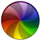
enter image description here

我到目前为止所做的努力:

.animation-wrapper {
width: 200px;
height: 200px;
border: 1px solid black;
border-radius: 50%;
position: relative;
overflow: hidden;
filter: brightness(0.8);
-webkit-filter: brightness(0.8);
}
.pie-piece1 {
position: absolute;
width: 50%;
height: 50%;
bottom: 0;
left: 0;
background: linear-gradient(to right, rgba(255, 0, 0, 1) 0%, rgba(255, 255, 0, 1) 100%);
}
.pie-piece2 {
position: absolute;
width: 50%;
height: 50%;
bottom: 0;
right: 0;
background: linear-gradient(to right, rgba(255, 255, 0, 1) 0%, rgba(0, 255, 0, 1) 100%);
}
.pie-piece3 {
position: absolute;
width: 50%;
height: 50%;
top: 0;
left: 0;
background: linear-gradient(to right, rgba(255, 0, 0, 1) 0%, rgba(255, 0, 255, 1) 100%);
}
.pie-piece4 {
position: absolute;
width: 50%;
height: 50%;
top: 0;
right: 0;
background: linear-gradient(to right, rgba(255, 0, 255, 1) 0%, rgba(0, 0, 255, 1) 100%);
}
.rotating-spinners {
position: absolute;
}
.spike {
fill: rgba(22, 22, 22, 0.5);
}
<figure class="animation-wrapper">
<div class="pie-piece1"></div>
<div class="pie-piece2"></div>
<div class="pie-piece3"></div>
<div class="pie-piece4"></div>
<svg class="rotating-spinners" width="100%" height="100%" viewBox="0 0 100 100" xmlns="http://www.w3.org/2000/svg" xmlns:xlink="http://www.w3.org/1999/xlink">
<defs>
<path id="spin-part" class="spike" d="M 65,-40 C 65,-40 80,20 50,50 60,40 50,-40 50,-40Z" />
</defs>
<use x="0" y="0" xlink:href="#spin-part" />
<use x="0" y="0" xlink:href="#spin-part" transform="rotate(60, 50, 50)" />
<use x="0" y="0" xlink:href="#spin-part" transform="rotate(120, 50, 50)" />
<use x="0" y="0" xlink:href="#spin-part" transform="rotate(180, 50, 50)" />
<use x="0" y="0" xlink:href="#spin-part" transform="rotate(240, 50, 50)" />
<use x="0" y="0" xlink:href="#spin-part" transform="rotate(300, 50, 50)" />
</svg>
</figure>

线性渐变似乎没有正确的排列,因为我不能找到一种方法,使梯度去两个方向。

有没有一种方法可以只使用 CSS 或 SVG 来创建它,而不用像我一样混合它们?

或者有其他的解决方案,我可以使用像画布或某种图像魔术?

5843 次浏览

我不得不使用 SVG 和 CSS 渐变的混合来做这件事,我知道这违背了我的要求,但是这是我所知道的。我用了一些你的原始代码大部分是用于螺旋桨形状的 SVG 部分。

径向梯度由12个 li元素构成。

.wheel,
.umbrella,
.color {
content: "";
position: absolute;
border-radius: 50%;
width: 15em;
height: 15em;
margin: 0;
padding: 0;
}
.wheel {
overflow: hidden;
width: 15em;
height: 15em;
position: relative;
}
.umbrella {
position: relative;
-webkit-transform: scale(1.35);
}
.color,
.color:nth-child(n+7):after {
clip: rect(0, 15em, 15em, 7.5em);
}
.color:after,
.color:nth-child(n+7) {
content: "";
position: absolute;
border-radius: 50%;
left: calc(50% - 7.5em);
top: calc(50% - 7.5em);
width: 15em;
height: 15em;
clip: rect(0, 7.5em, 15em, 0);
}
.color:nth-child(1):after {
background-color: #9ED110;
transform: rotate(30deg);
z-index: 12;
}
.color:nth-child(2):after {
background-color: #50B517;
transform: rotate(60deg);
z-index: 11;
}
.color:nth-child(3):after {
background-color: #179067;
transform: rotate(90deg);
z-index: 10;
}
.color:nth-child(4):after {
background-color: #476EAF;
transform: rotate(120deg);
z-index: 9;
}
.color:nth-child(5):after {
background-color: #9f49ac;
transform: rotate(150deg);
z-index: 8;
}
.color:nth-child(6):after {
background-color: #CC42A2;
transform: rotate(180deg);
z-index: 7;
}
.color:nth-child(7):after {
background-color: #FF3BA7;
transform: rotate(180deg);
}
.color:nth-child(8):after {
background-color: #FF5800;
transform: rotate(210deg);
}
.color:nth-child(9):after {
background-color: #FF8100;
transform: rotate(240deg);
}
.color:nth-child(10):after {
background-color: #FEAC00;
transform: rotate(270deg);
}
.color:nth-child(11):after {
background-color: #FFCC00;
transform: rotate(300deg);
}
.color:nth-child(12):after {
background-color: #EDE604;
transform: rotate(330deg);
}
<div class="wheel">
<ul class="umbrella">
<li class="color"></li>
</ul>
</div>


然后,这12个元素可以模糊在一起,形成光滑的梯度。

然后,我动画的旋转部分,使您需要的效果。

var rotation = 0;


$(document).ready(function() {
setInterval(function() {
rotation += 1;
$('.wheel svg').css({
'transform': 'rotate(' + rotation + 'deg)'
});;
}, 10);
});
.wheel,
.umbrella,
.color {
content: "";
position: absolute;
border-radius: 50%;
width: 15em;
height: 15em;
margin: 0;
padding: 0;
}
.wheel {
overflow: hidden;
width: 15em;
height: 15em;
position: relative;
}
.umbrella {
position: relative;
filter: blur(.75em);
-webkit-filter: blur(.75em);
-moz-filter: blur(.75em);
-o-filter: blur(.75em);
-ms-filter: blur(.75em);
filter: url(#blur);
filter: progid: DXImageTransform.Microsoft.Blur(PixelRadius='.75');
-webkit-transform: scale(1.35);
}
.color,
.color:nth-child(n+7):after {
clip: rect(0, 15em, 15em, 7.5em);
}
.color:after,
.color:nth-child(n+7) {
content: "";
position: absolute;
border-radius: 50%;
left: calc(50% - 7.5em);
top: calc(50% - 7.5em);
width: 15em;
height: 15em;
clip: rect(0, 7.5em, 15em, 0);
}
.color:nth-child(1):after {
background-color: #9ED110;
transform: rotate(30deg);
z-index: 12;
}
.color:nth-child(2):after {
background-color: #50B517;
transform: rotate(60deg);
z-index: 11;
}
.color:nth-child(3):after {
background-color: #179067;
transform: rotate(90deg);
z-index: 10;
}
.color:nth-child(4):after {
background-color: #476EAF;
transform: rotate(120deg);
z-index: 9;
}
.color:nth-child(5):after {
background-color: #9f49ac;
transform: rotate(150deg);
z-index: 8;
}
.color:nth-child(6):after {
background-color: #CC42A2;
transform: rotate(180deg);
z-index: 7;
}
.color:nth-child(7):after {
background-color: #FF3BA7;
transform: rotate(180deg);
}
.color:nth-child(8):after {
background-color: #FF5800;
transform: rotate(210deg);
}
.color:nth-child(9):after {
background-color: #FF8100;
transform: rotate(240deg);
}
.color:nth-child(10):after {
background-color: #FEAC00;
transform: rotate(270deg);
}
.color:nth-child(11):after {
background-color: #FFCC00;
transform: rotate(300deg);
}
.color:nth-child(12):after {
background-color: #EDE604;
transform: rotate(330deg);
}
body {
padding: 5px;
}
.wheel svg {
position: absolute;
top: 0;
opacity: .5;
}
<script src="https://ajax.googleapis.com/ajax/libs/jquery/2.1.1/jquery.min.js"></script>
<figure class="animation-wrapper wheel">
<ul class="umbrella">
<li class="color"></li>
</ul>
<svg class="rotating-spinners" width="100%" height="100%" viewBox="0 0 100 100" xmlns="http://www.w3.org/2000/svg" xmlns:xlink="http://www.w3.org/1999/xlink">
<defs>
<path id="spin-part" class="spike" d="M 65,-40 C 65,-40 80,20 50,50 60,40 50,-40 50,-40Z" />
</defs>
<use x="0" y="0" xlink:href="#spin-part" />
<use x="0" y="0" xlink:href="#spin-part" transform="rotate(60, 50, 50)" />
<use x="0" y="0" xlink:href="#spin-part" transform="rotate(120, 50, 50)" />
<use x="0" y="0" xlink:href="#spin-part" transform="rotate(180, 50, 50)" />
<use x="0" y="0" xlink:href="#spin-part" transform="rotate(240, 50, 50)" />
<use x="0" y="0" xlink:href="#spin-part" transform="rotate(300, 50, 50)" />
</svg>
</figure>

帆布进场

因为这是一个加载动画,其中的尺寸可能是固定的,几乎没有用户交互,画布也是一个不错的选择,因为它没有添加任何额外的元素到 DOM。画布绘制命令与 SVG 非常相似,而且 浏览器支持也不差。

一个缺点是 Canvas 没有自己的模糊过滤器(不像 SVG)。但是这可以通过使用 CSS 模糊过滤器(有非常低的浏览器支持)或者 这个堆栈溢出线程中提到的库来克服。


背景渐变车轮:

背景渐变轮是使用类似于 我的答案就在这里中详细描述的方法创建的。基本上,我们在圆中找到多个点,然后画出每条线,每条线都有不同的颜色笔画。通过修改每条线的 hue值,我们可以绘制渐变轮。

在下面的截图中,第一张图片显示了如果我们只画了24条线(每条线之间的 hue变化为15) ,背景看起来会是什么样子。第二张图片是我们实际的渐变轮,它总共有360条线,每条线的 hue增加1。

范:

使用与 SVG 代码片段中相同的方法创建扇区。路径命令用于绘制每个辐条。虽然在 SVG 中使用 use标记来重复形状,但是可以在 Canvas 中使用循环。

这里 SVG 和 Canvas 的主要区别在于 Canvas 不能将转换原点作为 rotate函数的参数,因此在应用旋转之前必须将上下文转换为中心点。

最后,必须将画布裁剪成圆形,因为默认形状是正方形(因为高度和宽度相同)。下面的截图显示了风扇的未剪辑和剪辑版本。

然后这个风扇被放置在背景渐变轮的顶部。

3D 效果:

顶部的3D 效果是通过在背景和风扇上添加一个具有更高透明度的小圆弧来实现的。

下面是没有任何动画的完整图片的截图。

动画:

通过使用 window.requestAnimationFrame方法添加动画,该方法定期调用作为参数传递的函数。此方法通常每秒调用函数约60次(根据 MDN)。通过在每次迭代中增加 counter变量的值,并将其添加到风扇辐条的角度,可以达到动画效果。

window.onload = function() {
var canvas = document.querySelector("#canvas"),
ctx = canvas.getContext("2d"),
counter = 360;


function fan() {
ctx.clearRect(0, 0, 100, 100);
for (var i = 0; i < 360; i++) {
ctx.strokeStyle = "hsl(" + (180 - i) + ", 60%, 50%)";
ctx.beginPath();
ctx.moveTo(50, 50);
x = 50 + 50 * Math.cos((i / 360) * Math.PI * 2);
y = 50 + 50 * Math.sin((i / 360) * Math.PI * 2)
ctx.lineTo(x, y);
ctx.lineWidth = 2;
ctx.stroke();
}
counter++;
for (var j = 0; j < 6; j++) {
ctx.save();
ctx.beginPath();
ctx.arc(50, 50, 50, 0, Math.PI * 2, true);
ctx.clip();
ctx.translate(50, 50);
ctx.rotate(((60 * j) + counter) * Math.PI / 180);
ctx.beginPath();
ctx.moveTo(0, 0);
ctx.bezierCurveTo(0, 0, 30, 50, 100, 0);
x = 75 * Math.cos((-20 / 360) * Math.PI * 2);
y = 75 * Math.sin((-20 / 360) * Math.PI * 2)
ctx.lineTo(x, y);
ctx.bezierCurveTo(x, y, (x - 30), (y + 40), 0, 0);
ctx.closePath();
ctx.fillStyle = "rgba(0,0,0,0.5)";
ctx.fill();
ctx.restore();
}
ctx.save();
ctx.beginPath();
ctx.arc(50, 50, 50, 0, Math.PI, true);
ctx.arc(50, 55, 50, Math.PI, 0, false);
ctx.fillStyle = "rgba(0,0,0,0.15)";
ctx.closePath();
ctx.fill();
ctx.restore();
window.requestAnimationFrame(fan);
}
fan();
}
<canvas width='100px' height='100px' id='canvas'></canvas>


SVG Approach

The same approach as described above can be used with SVG also. The only downside would be the no. of extra elements that get added to the DOM both for the background and the fan.

window.onload = function() {
var colorWheel = document.querySelector("#color-wheel");
for (var i = 0; i < 360; i++) {
lineColor = "hsl(" + (180 - i) + ", 60%, 50%)";
x = 50 + 50 * Math.cos((i / 360) * Math.PI * 2);
y = 50 + 50 * Math.sin((i / 360) * Math.PI * 2);
line = document.createElementNS("http://www.w3.org/2000/svg", "line");
line.setAttribute('x1', 50);
line.setAttribute('y1', 50);
line.setAttribute('x2', x);
line.setAttribute('y2', y);
line.setAttribute('stroke', lineColor);
line.setAttribute('stroke-width', 2);
colorWheel.appendChild(line);
}
}
<svg class="rotating-spinners" width="100px" height="100px" viewBox="0 0 100 100" xmlns="http://www.w3.org/2000/svg" xmlns:xlink="http://www.w3.org/1999/xlink">
<defs>
<path id="spin-part" class="spike" d="M 50,50 c0,0 30,50 100,0 l-5,-35 c0,0 -30,50 -95,35Z" />
<clipPath id="shape">
<circle r="50" cx="50" cy="50" />
</clipPath>
<clipPath id="shade">
<path d='M-5,55 a55,55 1 0,1 110,0 h-5 a50,50 1 0,0 -100,0' />
</clipPath>
</defs>
<g id='color-wheel' clip-path='url(#shape)'>
</g>
<g id='fan' fill-opacity="0.5" clip-path='url(#shape)'>
<use x="0" y="0" xlink:href="#spin-part" />
<use x="0" y="0" xlink:href="#spin-part" transform="rotate(60, 50, 50)" />
<use x="0" y="0" xlink:href="#spin-part" transform="rotate(120, 50, 50)" />
<use x="0" y="0" xlink:href="#spin-part" transform="rotate(180, 50, 50)" />
<use x="0" y="0" xlink:href="#spin-part" transform="rotate(240, 50, 50)" />
<use x="0" y="0" xlink:href="#spin-part" transform="rotate(300, 50, 50)" />
<animateTransform attributeType="xml" attributeName="transform" type="rotate" from="0,50,50" to="360,50,50" dur="6s" repeatCount="indefinite" />
</g>
<circle r='50' cx='50' cy='50' fill-opacity='0.15' clip-path='url(#shade)' />
</svg>


混合办法

或者,如果您对风扇的额外元素没有问题,只是想避免添加360个 line元素,那么您可以像下面的代码片段那样,对风扇使用 Canvas (作为背景)和 SVG。

window.onload = function() {
var canvas = document.querySelector("#canvas");
var ctx = canvas.getContext("2d");


for (var i = 0; i < 360; i++) {
ctx.strokeStyle = "hsl(" + (180 - i) + ", 60%, 50%)";
ctx.beginPath();
ctx.moveTo(50, 50);
x = 50 + 50 * Math.cos((i / 360) * Math.PI * 2);
y = 50 + 50 * Math.sin((i / 360) * Math.PI * 2)
ctx.lineTo(x, y);
ctx.lineWidth = 2;
ctx.stroke();
}
ctx.save();
ctx.beginPath();
ctx.arc(50, 50, 50, 0, Math.PI, true);
ctx.arc(50, 55, 50, Math.PI, 0, false);
ctx.fillStyle = "rgba(0,0,0,0.15)";
ctx.closePath();
ctx.fill();
ctx.restore();
}
div {
position: relative;
height: 100px;
width: 100px;
}
canvas,
svg {
position: absolute;
top: 0px;
left: 0px;
height: 100%;
width: 100%;
}
<script src="https://cdnjs.cloudflare.com/ajax/libs/prefixfree/1.0.7/prefixfree.min.js"></script>
<div class='container'>
<canvas width='100px' height='100px' id='canvas'></canvas>
<svg class="rotating-spinners" width="100%" height="100%" viewBox="0 0 100 100" xmlns="http://www.w3.org/2000/svg" xmlns:xlink="http://www.w3.org/1999/xlink">
<defs>
<path id="spin-part" class="spike" d="M 50,50 c0,0 30,50 100,0 l-5,-35 c0,0 -30,50 -95,35Z" />
<clipPath id="shape">
<circle r="50" cx="50" cy="50" />
</clipPath>
</defs>
<g id='fan' fill-opacity="0.5" clip-path="url(#shape)">
<use x="0" y="0" xlink:href="#spin-part" />
<use x="0" y="0" xlink:href="#spin-part" transform="rotate(60, 50, 50)" />
<use x="0" y="0" xlink:href="#spin-part" transform="rotate(120, 50, 50)" />
<use x="0" y="0" xlink:href="#spin-part" transform="rotate(180, 50, 50)" />
<use x="0" y="0" xlink:href="#spin-part" transform="rotate(240, 50, 50)" />
<use x="0" y="0" xlink:href="#spin-part" transform="rotate(300, 50, 50)" />
<animateTransform attributeType="xml" attributeName="transform" type="rotate" from="0,50,50" to="360,50,50" dur="6s" repeatCount="indefinite" />
</g>
</svg>
</div>

这是我的 SVG 版本。背景颜色轮不是很完美,但我想我已经很接近了。

<svg width="135" height="135" viewBox="0 0 200 200">
<defs>
<filter id="blur" color-interpolation-filters="linear">
<feGaussianBlur in="SourceGraphic" stdDeviation="11"/>
</filter>
<mask id="mask">
<circle cx="0" cy="0" r="90" fill="white"/>
</mask>
<linearGradient id="gloss" x2="0" y2="0.4">
<stop offset="0" stop-color="white" stop-opacity="0.5"/>
<stop offset="1" stop-color="white" stop-opacity="0"/>
</linearGradient>
</defs>


<g transform="translate(100,100)" mask="url(#mask)">
<g filter="url(#blur)">
<polygon points="0,0, -100,-26.8, -100,26.8" fill="#c44"/>
<polygon points="0,0, -100,-26.8, -100,26.8" fill="#c09" transform="rotate(30)"/>
<polygon points="0,0, -100,-26.8, -100,26.8" fill="#c0c" transform="rotate(60)"/>
<polygon points="0,0, -100,-26.8, -100,26.8" fill="#90c" transform="rotate(90)"/>
<polygon points="0,0, -100,-26.8, -100,26.8" fill="#44c" transform="rotate(120)"/>
<polygon points="0,0, -100,-26.8, -100,26.8" fill="#09c" transform="rotate(150)"/>
<polygon points="0,0, -100,-26.8, -100,26.8" fill="#0cc" transform="rotate(180)"/>
<polygon points="0,0, -100,-26.8, -100,26.8" fill="#0c9" transform="rotate(210)"/>
<polygon points="0,0, -100,-26.8, -100,26.8" fill="#4c4" transform="rotate(240)"/>
<polygon points="0,0, -100,-26.8, -100,26.8" fill="#9c0" transform="rotate(270)"/>
<polygon points="0,0, -100,-26.8, -100,26.8" fill="#cc0" transform="rotate(300)"/>
<polygon points="0,0, -100,-26.8, -100,26.8" fill="#c90" transform="rotate(330)"/>
</g>
<g transform="scale(0.9,0.9)">
<path d="M0,0C5,-61,-32,-86,-95,-90L-100,-46C-65,-53,-24,-35,0,0Z" fill="black" fill-opacity="0.4"/>
<path d="M0,0C5,-61,-32,-86,-95,-90L-100,-46C-65,-53,-24,-35,0,0Z" fill="black" fill-opacity="0.4" transform="rotate(60)"/>
<path d="M0,0C5,-61,-32,-86,-95,-90L-100,-46C-65,-53,-24,-35,0,0Z" fill="black" fill-opacity="0.4" transform="rotate(120)"/>
<path d="M0,0C5,-61,-32,-86,-95,-90L-100,-46C-65,-53,-24,-35,0,0Z" fill="black" fill-opacity="0.4" transform="rotate(180)"/>
<path d="M0,0C5,-61,-32,-86,-95,-90L-100,-46C-65,-53,-24,-35,0,0Z" fill="black" fill-opacity="0.4" transform="rotate(240)"/>
<path d="M0,0C5,-61,-32,-86,-95,-90L-100,-46C-65,-53,-24,-35,0,0Z" fill="black" fill-opacity="0.4" transform="rotate(300)"/>
<animateTransform attributeType="xml" attributeName="transform" type="rotate" from="0" to="360" dur="4s" repeatCount="indefinite"/>


</g>
<circle r="83" fill="url(#gloss)"/>
<circle r="90" fill="none" stroke="black" stroke-width="2"/>
</g>
</svg>

这就是我的努力。锥形渐变是通过计算 OP 发布的动画 GIF 中每个像素的最大值来提取的嵌入式位图图像。一个半不透明的黑色风车模式是叠加在上面,并动画,和一个模糊过滤器摆脱 JPEG 工件。

(编辑: 增加了一个反射高光,使它看起来更加3D)

<svg xmlns="http://www.w3.org/2000/svg" xmlns:xlink="http://www.w3.org/1999/xlink"
width="121" height="121" viewBox="0 0 121 121">
<defs>
<clipPath id="circ">
<circle r="60" cx="60.5" cy="60.5"/>
</clipPath>
<linearGradient id="shine" x1="0%" y1="0%" x2="0%" y2="100%">
<stop offset="0%" style="stop-color:#fff;stop-opacity:0.6" />
<stop offset="10%" style="stop-color:#fff;stop-opacity:0.3" />
<stop offset="20%" style="stop-color:#fff;stop-opacity:0.1" />
<stop offset="40%" style="stop-color:#fff;stop-opacity:0" />
</linearGradient>
<filter id="blur">
<feGaussianBlur in="SourceGraphic" stdDeviation="2"/>
</filter>
</defs>
<image width="121" height="121" filter="url(#blur)" xlink:href="data:image/jpeg;base64,
/9j/4AAQSkZJRgABAQEASABIAAD/2wBDACAWGBwYFCAcGhwkIiAmMFA0MCwsMGJGSjpQdGZ6eHJm
cG6AkLicgIiuim5woNqirr7EztDOfJri8uDI8LjKzsb/2wBDASIkJDAqMF40NF7GhHCExsbGxsbG
xsbGxsbGxsbGxsbGxsbGxsbGxsbGxsbGxsbGxsbGxsbGxsbGxsbGxsbGxsb/wgARCAB5AHkDASEA
AhEBAxEB/8QAGQAAAwEBAQAAAAAAAAAAAAAAAAECBAMF/8QAGAEAAwEBAAAAAAAAAAAAAAAAAAEC
AwT/2gAMAwEAAhADEAAAAfQAXAM9O7YlzoXdLQ5QAIMSL6gA0DS50G6UyRYUyi2NBQhoHMMNzzM2
VX0BgwKQqSHJDWvTk/McagAMC0TcBUoA9LM8x49ACBjNJlawIlgl0kh8/SIAAekwbYgJiSEUc3WA
AIdRBrgAhggLOfsAGxVc5xFc6WiBgN08O0AdKbqM551lKuBUjpV1OXWNN0oqohQ84V5pUr3aac8u
fQ3FOpmnMKXEzWSVLX322WVXD59aamnMEkTNZzehre+ogzLn0p5lEyJzMvN6emmXQAuSIrlunmKX
E9OhdHswAAAJzQ+tcbnnqtFdSAAD/8QAIBAAAgICAwADAQAAAAAAAAAAAQIAEQMwEBIgIjFAIf/a
AAgBAQABBQLlsoE+TQIJ1EoTqIUE+SxcoPt3LQLWhluJkKnxkfsR/NRFzG/U8ZWoLsaYXsRj2fah
6vcG4zv+ipX4CPwH30jCm2qLapkW92NaHDLWxFvyVrUFv2U0BdJ+oODwPrz/AP/EABwRAQACAgMB
AAAAAAAAAAAAAAEAEAIgETAxIf/aAAgBAwEBPwGvN/Nzox87Hod2O+T8nO+Ud2NkPKYxvHyYNNMa
Ji8OjGB9sbYwNOegp0//xAAfEQABBAMAAwEAAAAAAAAAAAABAAIRIBAwMQMSIUH/2gAIAQIBAT8B
pKI0BOEaD9Gk0CGX9oEMkTRugOheylTUoFTcUPajAT9DhIsz7l4irRAyRKc0jLGfpq/mPH2n/8QA
HhAAAQQBBQAAAAAAAAAAAAAAEQEgITAQAAJAUHD/2gAIAQEABj8CzFEvCVDc0JYFyPADceljUvni
/wD/xAAdEAADAAIDAQEAAAAAAAAAAAAAAREQMSAhQTBh/9oACAEBAAE/Ic9R2Y3vcR6iHh+A2+Hi
6LrdR1PR8m0lWNfEVtvFLilwnTpnggTTVXBnhCpClKUpSlKKUd4+evbYkRSlKUpSlKUSq+nRvaxY
ZSlKUpSlKUpSC/GTlSlKUpSlLi5VypRvnOcKn0QhBInWCEJyhMQglhBomJiFFREIQgkLDGhomZiJ
JI2sQSIImGhog0Qh3DbzbVrMEuDRCYrr1waqjHa6FzYxz96EoouXp0O1oLgzt6R69vlPZrl7zv/a
AAwDAQACAAMAAAAQCZ9GgAVrOID+MKOo0R0OMKN+ec1rZcb1FaGkEgox777+BDUwvvfOejgbCEVt
p82ChkNz+AVXCzANstqAAEMAAP/EABoRAAMBAQEBAAAAAAAAAAAAAAABERAgITH/2gAIAQMBAT8Q
Eq4eeENso1wlHa1j9Jj4SVrGXUokiEHh4iExjansPgb0pS8SwvLPQkZSixjwvurR6g+C8UeEHh8S
RTAYx7W1ZDHhCS1OMVDGJc/XT//EABsRAQEBAQEBAQEAAAAAAAAAAAEAERAhMSBh/9oACAECAQE/
EOHlsItTT9kstHnGIiODw4/eERZEMU6PAs4PrpyO+S3mz1vlttvdiWwXtvNtlzINvNlllDDDt5my
ywyhvmGOyy2wwwwYcBZbYYYa7u/ktsMfjCGMz7w98s/0D9/J/8QAIxABAAICAgICAgMAAAAAAAAA
AQARECExQSBRMGGhsXGBkf/aAAgBAQABPxDCgWxl/q4naJ0QW2rDhCfVnIGK21QfaF0xz/bgiWeL
pKCIXTuzfbRYZLyX7mygIbujDSWOVotlzdeX3KUc/EAKA8y1W3DBssxuGW2eX4AL4dpnCbP68Khw
NHixgcD4sUjkpn3zhfcvwBJDDgcV4K6rkl/UVS5cuXLhDpgtwMuEduFeFSmWl1yKOZUqVKm5WKlS
sCCbXiB6Sh4jLgrwrJULQ6E6IFFZVisKw/mjdRdmQgjsglQalmFiokfqrtn1zQkAvwAwiomBwGGk
1BgSymPWb/iBAhgBKlYGGEiCWv5gUUZJgsY7e36ylagQIEqJEggqXoV+8IgoPFBKYS229RtpD7jH
hIYYg5SFtM/cMbbeoFFHwc04MnGHKcXl/9k=" clip-path="url(#circ)" />
<g transform="translate(60.5,60.5)">
<path d="M0 0A56 56 0 0 0 0 56 56 56 0 0 0 32.916 45.305 56 56 0 0 1 0 0 56
56 0 0 0 53.259 17.305 56 56 0 0 0 53.259-17.305 56 56 0 0 1 0 0 56 56
0 0 0 32.916-45.305 56 56 0 0 0 0-56 56 56 0 0 1 0 0 56 56 0 0 0
-32.916-45.305 56 56 0 0 0-53.259-17.305 56 56 0 0 1 0 0 56 56 0 0 0
-53.259 17.305 56 56 0 0 0-32.916 45.305 56 56 0 0 1 0 0Z"
stroke="none" fill="#000" opacity="0.25" transform="rotate(0)">
<animateTransform attributeName="transform" type="rotate" from="0"
to="72" begin="0s" dur="0.6s" repeatCount="indefinite" />
</path>
<circle r="59" stroke="#000" stroke-width="2" fill="none" opacity="0.25" />
<circle r="55" fill="url(#shine)" stroke="none" />
</g>
</svg>

这里是一个纯 CSS 解决方案,我将考虑只使用 元素。我将依靠的形状,我创建的 在先前的答案中和以上我会考虑一个 conic-gradient()

事实上,conic-gradient()只支持 Chrome 和 Safari,但我们很快就会得到更好的支持:

.box {
--R:50px; /*Radius*/
--c1:grey; /*first color*/
--c2:#fff; /*second color*/
  

--g1:var(--c1) 98%, transparent 100%;
--g2:var(--c2) 98%, transparent 100%;
width:calc(2*var(--R));
height:calc(2*var(--R));
border-radius:100%;
border:1px solid;
position:relative;
overflow:hidden;
display:inline-block;
background:conic-gradient(rgba(128, 0, 128,0.7), rgba(0, 0, 255,0.7),rgba(0, 128, 0,0.7),rgba(255, 255, 0,0.7), rgba(255, 0, 0,0.7), rgba(128, 0, 128,0.7));
box-shadow:0 3px 5px inset rgba(0,0,0,0.5);
}
.box::before,
.box::after{
content:"";
position:absolute;
z-index:-1;
top:0;
bottom:0;
left:0;
width:50%;
background:
/*we rotate by 30deg so will use :
sin(30deg)*R = 0.5xR
cos(30deg)*R = 0.866xR
*/
radial-gradient(circle var(--R) at calc(var(--R) + 0.866*var(--R)) calc(var(--R) - 0.5*var(--R))  ,var(--g1)),
radial-gradient(circle var(--R) at calc(var(--R) + 0.5*var(--R))   calc(var(--R) - 0.866*var(--R)),var(--g2)),
radial-gradient(circle var(--R) at var(--R)                        0                              ,var(--g1)),
radial-gradient(circle var(--R) at calc(var(--R) - 0.5*var(--R))   calc(var(--R) - 0.866*var(--R)),var(--g2)),
radial-gradient(circle var(--R) at calc(var(--R) - 0.866*var(--R)) calc(var(--R) - 0.5*var(--R))  ,var(--g1)),
radial-gradient(circle var(--R) at 0                               var(--R)                        ,var(--g2)),
radial-gradient(circle var(--R) at calc(var(--R) - 0.866*var(--R)) calc(var(--R) + 0.5*var(--R))  ,var(--g1));
transform-origin:right;
animation:animate 3s linear infinite;
}


/*the same shape rotated*/
.box::after {
animation-delay:-1.5s;
}


@keyframes animate {
to {
transform:rotate(-360deg);
}
}
<div class="box"></div>

Output

enter image description here

Here is in the other direction (like your animation)

.box {
--R:50px; /*Radius*/
--c1:grey; /*first color*/
--c2:#fff; /*second color*/
  

--g1:var(--c1) 98%, transparent 100%;
--g2:var(--c2) 98%, transparent 100%;
width:calc(2*var(--R));
height:calc(2*var(--R));
border-radius:100%;
border:1px solid;
position:relative;
overflow:hidden;
display:inline-block;
background:conic-gradient(rgba(128, 0, 128,0.7), rgba(0, 0, 255,0.7),rgba(0, 128, 0,0.7),rgba(255, 255, 0,0.7), rgba(255, 0, 0,0.7), rgba(128, 0, 128,0.7));
box-shadow:0 3px 5px inset rgba(0,0,0,0.5);
}
.box::before,
.box::after{
content:"";
position:absolute;
z-index:-1;
top:0;
bottom:0;
left:0;
width:50%;
background:
/*we rotate by 30deg so will use :
sin(30deg)*R = 0.5xR
cos(30deg)*R = 0.866xR
*/
radial-gradient(circle var(--R) at calc(var(--R) + 0.866*var(--R)) calc(var(--R) - 0.5*var(--R))  ,var(--g1)),
radial-gradient(circle var(--R) at calc(var(--R) + 0.5*var(--R))   calc(var(--R) - 0.866*var(--R)),var(--g2)),
radial-gradient(circle var(--R) at var(--R)                        0                              ,var(--g1)),
radial-gradient(circle var(--R) at calc(var(--R) - 0.5*var(--R))   calc(var(--R) - 0.866*var(--R)),var(--g2)),
radial-gradient(circle var(--R) at calc(var(--R) - 0.866*var(--R)) calc(var(--R) - 0.5*var(--R))  ,var(--g1)),
radial-gradient(circle var(--R) at 0                               var(--R)                        ,var(--g2)),
radial-gradient(circle var(--R) at calc(var(--R) - 0.866*var(--R)) calc(var(--R) + 0.5*var(--R))  ,var(--g1));
transform-origin:right;
animation:animate 3s linear infinite;
}


/*the same shape rotated*/
.box::after {
animation-delay:-1.5s;
}


@keyframes animate {
from {
transform:scale(-1,1) rotate(0deg);
}
to {
transform:scale(-1,1) rotate(-360deg);
}
}
<div class="box"></div>

Output

enter image description here