我如何使一个 CSS 玻璃/模糊效果覆盖工作?

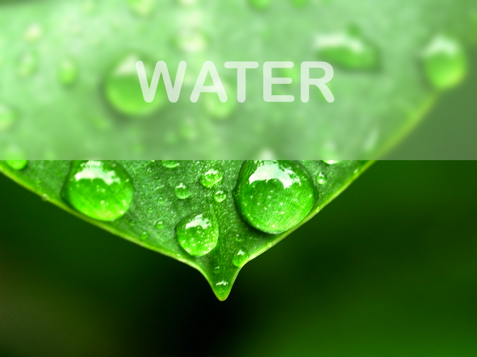
我有麻烦应用一个半透明叠加 div 模糊效果。我希望 Div 后面的东西都模糊一点,像这样:

SFW image

这里有一个不起作用的 jsfiddle: http://jsfiddle.net/u2y2091z/

有什么办法吗?我希望尽可能简单,而且是跨浏览器的。下面是我正在使用的 CSS:

#overlay {
position: absolute;
left: 0;
top: 0;
right: 0;
bottom: 0;


background:black;
background:rgba(0,0,0,0.8);


filter:blur(4px);
-o-filter:blur(4px);
-ms-filter:blur(4px);
-moz-filter:blur(4px);
-webkit-filter:blur(4px);
}
374371 次浏览

这是一个可能的解决办法。

超文本标示语言

<img id="source" src="http://www.byui.edu/images/agriculture-life-sciences/flower.jpg" />


<div id="crop">
<img id="overlay" src="http://www.byui.edu/images/agriculture-life-sciences/flower.jpg" />
</div>

CSS

#crop {
overflow: hidden;


position: absolute;
left: 100px;
top: 100px;


width: 450px;
height: 150px;
}


#overlay {
-webkit-filter:blur(4px);
filter:blur(4px);


width: 450px;
}


#source {
height: 300px;
width: auto;
position: absolute;
left: 100px;
top: 100px;
}

我知道 CSS 可以被简化,你也许应该去掉 id。这里的想法是使用 div 作为裁剪容器,然后对图像的重复部分应用模糊处理。小提琴

要在 Firefox 中实现这一点,您必须使用 SVG 黑客

如果你正在寻找一个可靠的跨浏览器方法 今天,你不会找到一个伟大的。您拥有的最佳选择是创建两个图像(这可以在某些环境中自动完成) ,并将其安排为一个覆盖另一个。我创建了一个简单的例子:

<figure class="js">
<img src="http://i.imgur.com/3oenmve.png" />
<img src="http://i.imgur.com/3oenmve.png?1" class="blur" />
</figure>
figure.js {
position: relative;
width: 250px; height: 250px;
}


figure.js .blur {
top: 0; left: 0;
position: absolute;
clip: rect( 0, 250px, 125px, 0 );
}

尽管有效,但即使是这种方法也不一定是理想的,也就是说,它确实产生了 期望的结果

enter image description here

下面是一个使用 svg过滤器的示例。

这个想法是使用 svg元素和 height一样,并在它上面应用 feGaussianblur过滤器。此过滤器应用于 svg image元件。为了给它一个挤压的效果,你可以使用一个 box-shadow的底部覆盖。

浏览器对 svg过滤器的支持

Demo on Codepen

body {
background: #222222;
}
#container {
position: relative;
width: 450px;
margin: 0 auto;
}
img {
height: 300px;
}
#overlay {
position: absolute;
left: 0;
top: 0;
width: 100%;
z-index: 1;
color: rgba(130, 130, 130, 0.5);
font-size: 50px;
text-align: center;
line-height: 100px;
box-shadow: 0 3px 5px rgba(0, 0, 0, 0.3);
}
<div id="container">
<img src="http://lorempixel.com/450/300/sports" />
<div id="overlay">WET</div>
<svg width="450" height="100" viewBox="0 0 450 100" style="position: absolute; top: 0;">
<defs>
<filter id="blur">
<feGaussianBlur in="SourceGraphic" stdDeviation="3" />
</filter>
</defs>
<image filter="url(#blur)" xlink:href="http://lorempixel.com/450/300/sports" x="0" y="0" height="300px" width="450px" />
</svg>
</div>

我能够把这里的每个人的信息拼凑起来,然后进一步用 Google 搜索,我想出了以下在 Chrome 和 Firefox 中都可以使用的东西: http://jsfiddle.net/xtbmpcsu/。我还在为 IE 和 Opera 做这个工作。

关键是将过滤器所应用到的 div 的内容 在里面:

body {
background: #300000;
background: linear-gradient(45deg, #300000, #000000, #300000, #000000);
color: white;
}
#mask {
position: absolute;
left: 0;
top: 0;
right: 0;
bottom: 0;
background-color: black;
opacity: 0.5;
}
img {
filter: blur(10px);
-webkit-filter: blur(10px);
-moz-filter: blur(10px);
-o-filter: blur(10px);
-ms-filter: blur(10px);
position: absolute;
left: 100px;
top: 100px;
height: 300px;
width: auto;
}
<div id="mask">
<p>Lorem ipsum ...</p>
<img src="http://www.byui.edu/images/agriculture-life-sciences/flower.jpg" />
</div>

所以蒙版已经应用了过滤器。另外,请注意 url ()用于带有值 <svg>标记的过滤器——这个想法来自于 http://codepen.io/AmeliaBR/pen/xGuBr。如果您恰好缩小了 CSS,可能需要将 SVG 筛选器标记中的任何空格替换为“% 20”。

所以现在,面具 div 里的所有东西都模糊了。

#bg, #search-bg {
background-image: url('https://images.pexels.com/photos/719609/pexels-photo-719609.jpeg?w=940&h=650&auto=compress&cs=tinysrgb');
background-repeat: no-repeat;
background-size: 1080px auto;
}


#bg {
background-position: center top;
padding: 70px 90px 120px 90px;
}


#search-container {
position: relative;
}


#search-bg {
/* Absolutely position it, but stretch it to all four corners, then put it just behind #search's z-index */
position: absolute;
top: 0px;
right: 0px;
bottom: 0px;
left: 0px;
z-index: 99;


/* Pull the background 70px higher to the same place as #bg's */
background-position: center -70px;


-webkit-filter: blur(10px);
filter: url('/media/blur.svg#blur');
filter: blur(10px);
}


#search {
/* Put this on top of the blurred layer */
position: relative;
z-index: 100;
padding: 20px;
background: rgb(34,34,34); /* for IE */
background: rgba(34,34,34,0.75);
}


@media (max-width: 600px ) {
#bg { padding: 10px; }
#search-bg { background-position: center -10px; }
}


#search h2, #search h5, #search h5 a { text-align: center; color: #fefefe; font-weight: normal; }
#search h2 { margin-bottom: 50px }
#search h5 { margin-top: 70px }
<div id="bg">
<div id="search-container">
<div id="search-bg"></div>
<div id="search">
<h2>Awesome</h2>
<h5><a href="#">How it works »</a></h5>
</div>
</div>
</div>

我想到了这个办法。

点击查看模糊效果图像

这是一种技巧,它使用一个绝对定位的子 div,将其背景图像设置为与父 div相同,然后将 background-attachment:fixed CSS 属性与父元素上设置的相同的 background属性一起使用。

然后对子 div 应用 filter:blur(10px)(或任何值)。

*{
margin:0;
padding:0;
box-sizing: border-box;
}
.background{
position: relative;
width:100%;
height:100vh;
background-image:url('https://images.unsplash.com/photo-1547937414-009abc449011?ixlib=rb-1.2.1&ixid=eyJhcHBfaWQiOjEyMDd9&auto=format&fit=crop&w=1350&q=80');
background-size:cover;
background-position: center;
background-repeat:no-repeat;
}


.blur{
position: absolute;
top:0;
left:0;
width:50%;
height:100%;
background-image:url('https://images.unsplash.com/photo-1547937414-009abc449011?ixlib=rb-1.2.1&ixid=eyJhcHBfaWQiOjEyMDd9&auto=format&fit=crop&w=1350&q=80');
background-position: center;
background-repeat: no-repeat;
background-attachment: fixed;
background-size:cover;
filter:blur(10px);
transition:filter .5s ease;
backface-visibility: hidden;
}


.background:hover .blur{
filter:blur(0);
}
.text{
display: inline-block;
font-family: sans-serif;
color:white;
font-weight: 600;
text-align: center;
position: relative;
left:25%;
top:50%;
transform:translate(-50%,-50%);
}
<head>
<title>Blurry Effect</title>
</head>
<body>
<div class="background">
<div class="blur"></div>
<h1 class="text">This is the <br>blurry side</h1>
</div>
</body>

对 Codepen 的看法

更简单和最新的答案:

backdrop-filter: blur(6px);

注意 浏览器支持不是完美的,但在大多数情况下模糊是不必要的。

这里有一个固定背景的解决方案,如果你有一个固定的背景,你有一些重叠的元素,你需要为他们模糊的背景,这个解决方案工作:

图片我们有这个简单的 HTML:

<body> <!-- or any wrapper -->
<div class="content">Some Texts</div>
</body>

<body>或包装器元素的固定背景:

body {
background-image: url(http://placeimg.com/640/360/any);
background-size: cover;
background-repeat: no-repeat;
background-attachment: fixed;
}

例如,这里我们有一个白色透明背景的叠加元素:

.content {
background-color: rgba(255, 255, 255, 0.3);
position: relative;
}

现在,我们需要使用完全相同的背景图片,我们的包装器叠加元素,我使用它作为一个 :before假想类:

.content:before {
content: '';
position: absolute;
top: 0;
left: 0;
width: 100%;
height: 100%;
z-index: -1;
filter: blur(5px);
background-image: url(http://placeimg.com/640/360/any);
background-size: cover;
background-repeat: no-repeat;
background-attachment: fixed;
}

由于固定背景在包装器和重叠元素中的工作方式是相同的,所以我们将背景放置在重叠元素的滚动位置上,并且可以简单地模糊它。 下面是一个在 Firefox、 Chrome、 Opera 和 Edge 中测试过的工作小提琴: < a href = “ https://jsfiddle.net/0vL2rc4d/”rel = “ nofollow norefrer”> https://jsfiddle.net/0vl2rc4d/

注意: 在 Firefox 中有一个 臭虫,当滚动屏幕时,它会使屏幕闪烁,并且有固定的模糊背景。如果有什么办法,告诉我

background: rgba(255,255,255,0.5);
backdrop-filter: blur(5px);

与其给你的内容添加一个模糊的背景, 你可以使用 背景滤光片。仅供参考,IE 11和 Firefox 可能不支持它。选中 犬科动物

演示:

header {
position: fixed;
width: 100%;
padding: 10px;
background: rgba(255,255,255,0.5);
backdrop-filter: blur(5px);
}
body {
margin: 0;
}
<header>
Header
</header>
<div>
<img src="https://dummyimage.com/600x400/000/fff" />
</div>

这样就会在内容上覆盖模糊效果:

.blur {
display: block;
bottom: 0;
left: 0;
position: fixed;
right: 0;
top: 0;
-webkit-backdrop-filter: blur(15px);
backdrop-filter: blur(15px);
background-color: rgba(0, 0, 0, 0.5);
}

backdrop-filter

... 应用图形效果,如模糊或颜色转移到该地区 因为它适用于元素后面的所有内容 元素,要查看效果,必须使元素或其背景 至少部分透明。