最佳答案
材质效果的按钮与背景色
我使用的是Android v21支持库。
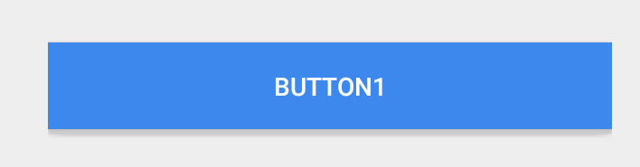
我已经创建了一个自定义背景色的按钮。当我使用背景色时,材质设计效果如波纹,显示消失了(除了点击时的抬高)。
 <Button
style="?android:attr/buttonStyleSmall"
android:background="?attr/colorPrimary"
android:textColor="@color/white"
android:textAllCaps="true"
android:layout_width="fill_parent"
android:layout_height="wrap_content"
android:text="Button1"
/>
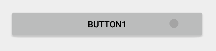
 下面是一个正常的按钮,效果很好
<Button
style="?android:attr/buttonStyleSmall"
android:layout_width="fill_parent"
android:layout_height="wrap_content"
android:textAllCaps="true"
android:text="Button1"
/>