如何处理所有可用的 iPhone 分辨率图像缩放?

如果我们想在 iPhone 肖像应用程序的所有分辨率中使用这张图片来覆盖屏幕的全宽和半高,那么什么尺寸最适合用于图片: backound.png、 back@2x.png 和 back@3x.png?
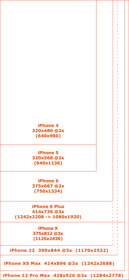
这就是我们现在拥有的:

Device                        Points   Log. Res.  Sc. Real Res.  PPI  Ratio   Size
iPhone 12 Pro Max, 13 Pro Max 926x428  2778x1284  3x  2778x1284  458  19.5:9  6.7"
iPhone 12, 12 Pro, 13, 13 Pro 844x390  2532x1170  3x  2532x1170  460  19.5:9  6.1"
iPhone 12 mini, 13 mini       812x375  2436x1125  3x  2340x1080  476  19.5:9  5.4"
iPhone XS Max, 11 Pro Max     896x414  2688x1242  3x  2688x1242  458  19.5:9  6.5"
iPhone XR, 11                 896x414  1792x828   2x  1792x828   326  19.5:9  6.1"
iPhone X, XS, 11 Pro          812x375  2436x1125  3x  2436x1125  458  19.5:9  5.8"
iPhone 6+, 6S+, 7+, 8+        736x414  2208x1242  3x  1920x1080  401  16:9    5.5"
iPhone 6, 6S, 7, 8, SE2       667x375  1334x750   2x  1334x750   326  16:9    4.7"
iPhone 5, 5S, 5C, SE1         568x320  1136x640   2x  1136x640   326  16:9    4.0"
iPhone 4, 4S                  480x320  960x640    2x  960x640    326  3:2     3.5"
iPhone 3GS                    480x320  480x320    1x  480x320    163  3:2     3.5"

iPhone resolutions

有人说,对于 iPhone 6 Plus 来说,边到边的图像(如屏幕底部从左到右的横幅) ,他们会准备回@3x.png,宽度为1242; 对于 iPhone 6来说,他们会准备回@2x.png,宽度为750,以匹配 iPhone 6的屏幕尺寸。然而,我不认为这是一个好主意,因为1242/3 = 414和750/2 = 375,所以把它们命名为@2x 和@3x 是没有意义的。然后什么宽度应该有回。 png-375或414?

图形名称使用@2x 和@3x 后缀,所以如果图像@3x.png 有30x30分辨率,那么逻辑思维图像@2x.png 应该有20x20分辨率,image. png 应该是10x10。这意味着,如果我们想为每个屏幕创建清晰的全宽图像,那么我们可能应该创建宽度为4143 = 1242px,back@2x.png,宽度为4142 = 828px 的 back@3x.png 和宽度为414px 的 back.png。然而,这意味着除了 iPhone 6 Plus 之外的所有 iPhone,你都需要设置你的 uiimages 来使用例如方面适合的内容模式,它们会被缩放,所以这也不是一个完美的解决方案,如果我们在老设备上使用大量的缩放,可能真的会降低应用的速度。

你认为解决这个问题的最好办法是什么?

77751 次浏览

For the @2x and @3x discussion, you don't really have to care about that. Care about the point size of the screen, and make sure that there are @2x assets with twice the point size and @3x assets with thrice the point size in pixels. The device will automatically pick the right one. But reading your post I guess you already know this.

For edge-to-edge images, then unfortunately you have to make it for all screen resolutions. So, for a portrait iPhone, it would be 320 points, 375 points and 414 points, where the 414 points one would have to be @3x. A better solution may be to make your images scalable by setting up the slicing in interface builder (if you use image catalogs, that is). But, depending on the image this may or may not be an option, depending whether the image has a repeatable or stretchable part. Scalable images set up like this have very little performance impact.

You don't have to have each image in all scales if it won't be used. Make only the sizes you need and name them according to their width. For portrait full-device-width images, you need 320px wide at 1x and 2x, 375px wide at 2x and 414px wide at 3x.

4" devices used "-568h" suffix for naming their launch images, so I'd recommend a similar naming scheme:

  • ImageName-320w (@1x & @2x)
  • ImageName-375w (@2x)
  • ImageName-414w (@3x)

Then figure out what image you need at runtime:

NSNumber *screenWidth = @([UIScreen mainScreen].bounds.size.width);
NSString *imageName = [NSString stringWithFormat:@"name-%@w", screenWidth];
UIImage *image = [UIImage imageNamed:imageName];

This might break if other widths are added in future, but so far Apple has always required rebuilding the app to support new displays so I guess it's somewhat safe to assume they will continue doing that.

I personally will be doing :

ImageName@2x iPhone 4/4s
ImageName-568h@2x iPhone 5/5s
ImageName-667h@2x iPhone 6
ImageName-736h@3x iPhone 6Plus

The logic behind this is that it shows a difference between all devices, whereas width shares the same value on the iPhone 5s and iPhone 4s

Edit:

This is just the naming convention I am using for resources that are device dependant, such as a background image taking the whole screen, most of the time all you want is:

ImageName@2x iPhone 4/4s/5/5s/6
ImageName@3x iPhone 6Plus/Zoom mode

the @2 and @3 is not the real image scaling, but only represent how much real pixel represent one virtual pixel on screen, some sort of hdpi/xhdpi/xxhdpi/blabla from android universe. it only show to system what image should be used for some device screen.

so if you need to use whole screen image - prepare it dependently of real screen size.

Depending on the graphics in some cases it might work fine when we use just a single image for example a banner with size 414 points width x 100 points height (largest possible width and some fixed height) and put it in a UIImageView that is pinned to the left and right edge of the screen, has fixed height 100 and set aspect fill mode for that UIImageView. Then on smaller devices left and right side of the image will be cut and we will see only the center part of the image.

I've created category for this:

+ (UIImage *)sizedImageWithName:(NSString *)name {
UIImage *image;
if (IS_IPHONE_5) {
image = [UIImage imageNamed:[NSString stringWithFormat:@"%@-568h",name]];
if (!image) {
image = [UIImage imageNamed:name];
}
}
else if (IS_IPHONE_6) {
image = [UIImage imageNamed:[NSString stringWithFormat:@"%@-750w",name]];
}
else {
image = [UIImage imageNamed:name];
}
return image;
}

you can take full code here: https://gist.github.com/YGeorge/e0a7fbb479f572b64ba5

I think the best solution for edge to edge or full screen images, is to care about the real screen size in pixel (not in point), and you must check at runtime the model of the device and choose the appropriate image i.e:

image-iphone4-4s.png (640x960/2) for 1/2 screen height, image-iphone5-5c-5s.png (640x1136/2) for 1/2 screen height, image-iphone6-6s.png (750x1334/2) for 1/2 screen height, image-iphone6plus-6splus.png (1242x2208/2) for 1/2 screen height,

there is no need for @?x in this situation of the asker.

i think we should use different size of background images for different devices. Just use @3x scale images for background.

You can detect device with below lines.

#define IS_IPAD (UI_USER_INTERFACE_IDIOM() == UIUserInterfaceIdiomPad)
#define IS_IPHONE (UI_USER_INTERFACE_IDIOM() == UIUserInterfaceIdiomPhone)
#define IS_RETINA ([[UIScreen mainScreen] scale] >= 2.0)


#define SCREEN_WIDTH ([[UIScreen mainScreen] bounds].size.width)
#define SCREEN_HEIGHT ([[UIScreen mainScreen] bounds].size.height)
#define SCREEN_MAX_LENGTH (MAX(SCREEN_WIDTH, SCREEN_HEIGHT))
#define SCREEN_MIN_LENGTH (MIN(SCREEN_WIDTH, SCREEN_HEIGHT))


#define IS_IPHONE_4_OR_LESS (IS_IPHONE && SCREEN_MAX_LENGTH < 568.0)
#define IS_IPHONE_5 (IS_IPHONE && SCREEN_MAX_LENGTH == 568.0)
#define IS_IPHONE_6 (IS_IPHONE && SCREEN_MAX_LENGTH == 667.0)
#define IS_IPHONE_6P (IS_IPHONE && SCREEN_MAX_LENGTH == 736.0)