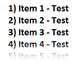
Is it possible to achieve this with just one div (no background images/foreground images/layers)?
<style> .fade { position: relative; bottom: 4em; height: 4em; background: -webkit-linear-gradient( rgba(255, 255, 255, 0) 0%, rgba(255, 255, 255, 1) 100% ); background-image: -moz-linear-gradient( rgba(255, 255, 255, 0) 0%, rgba(255, 255, 255, 1) 100% ); background-image: -o-linear-gradient( rgba(255, 255, 255, 0) 0%, rgba(255, 255, 255, 1) 100% ); background-image: linear-gradient( rgba(255, 255, 255, 0) 0%, rgba(255, 255, 255, 1) 100% ); background-image: -ms-linear-gradient( rgba(255, 255, 255, 0) 0%, rgba(255, 255, 255, 1) 100% ); } </style>
这里有一个例子为你 http://jsfiddle.net/nrgx7/
Codeen 上的示例: http://codepen.io/anon/pen/sbHAc/
相关的 CSS
ol { border : 1px #d8d8d8 dashed; position : relative; } ol:after { content : ""; position : absolute; z-index : 1; bottom : 0; left : 0; pointer-events : none; background-image : linear-gradient(to bottom, rgba(255,255,255, 0), rgba(255,255,255, 1) 90%); width : 100%; height : 4em; }
结果
如果浏览器支持 pointer-events属性(除 IE<=10之外的所有主要浏览器) ,那么渐变下的文本也是可选/可点击的。
pointer-events
IE<=10
我(个人)发现使用辅助元素作为“重叠”非常有效。为此,我定义了一个新的 tag。这使得在最后使用 <fade/>向任何元素添加所需的 淡出效果变得非常容易。
tag
<fade/>
div { position: relative; } fade { position: absolute; bottom: 0px; display: block; width: 100%; height: 50px; background-image: linear-gradient(to bottom, rgba(255, 255, 255, 0), rgba(255, 255, 255, 0.9) 100%); }
<div> text <br> text <br> text <fade/> </div>
给 fade元素一个具有 gradient背景的 absolute位置,正如预期的那样。只要你记得把父母的位置设置为 relative。
fade
gradient
absolute
relative