如何在 CSS 的图像覆盖?

我正在努力实现这样的目标:

this effect

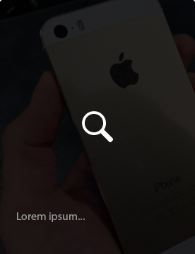
当我悬停在一个图像,我想把这个图像与一些文字和图标的深色。

我被困在这里了。我找到了一些教程,但他们不适合这种情况。 另外,还有一个问题——每个图像都有不同的高度,宽度总是相同的。

怎样才能达到这种效果?

289446 次浏览

You can achieve this with this simple CSS/HTML:

.image-container {
position: relative;
width: 200px;
height: 300px;
}
.image-container .after {
position: absolute;
top: 0;
left: 0;
width: 100%;
height: 100%;
display: none;
color: #FFF;
}
.image-container:hover .after {
display: block;
background: rgba(0, 0, 0, .6);
}

HTML

<div class="image-container">
<img src="http://lorempixel.com/300/200" />
<div class="after">This is some content</div>
</div>

Demo: http://jsfiddle.net/6Mt3Q/


UPD: Here is one nice final demo with some extra stylings.

.image-container {
position: relative;
display: inline-block;
}
.image-container img {display: block;}
.image-container .after {
position: absolute;
top: 0;
left: 0;
width: 100%;
height: 100%;
display: none;
color: #FFF;
}
.image-container:hover .after {
display: block;
background: rgba(0, 0, 0, .6);
}
.image-container .after .content {
position: absolute;
bottom: 0;
font-family: Arial;
text-align: center;
width: 100%;
box-sizing: border-box;
padding: 5px;
}
.image-container .after .zoom {
color: #DDD;
font-size: 48px;
position: absolute;
top: 50%;
left: 50%;
margin: -30px 0 0 -19px;
height: 50px;
width: 45px;
cursor: pointer;
}
.image-container .after .zoom:hover {
color: #FFF;
}
<link href="//netdna.bootstrapcdn.com/font-awesome/4.0.3/css/font-awesome.min.css" rel="stylesheet"/>


<div class="image-container">
<img src="http://lorempixel.com/300/180" />
<div class="after">
<span class="content">This is some content. It can be long and span several lines.</span>
<span class="zoom">
<i class="fa fa-search"></i>
</span>
</div>
</div>

You could use a pseudo element for this, and have your image on a hover:

.image {
position: relative;
height: 300px;
width: 300px;
background: url(http://lorempixel.com/300/300);
}
.image:before {
content: "";
position: absolute;
top: 0;
left: 0;
height: 100%;
width: 100%;
transition: all 0.8s;
opacity: 0;
background: url(http://lorempixel.com/300/200);
background-size: 100% 100%;
}
.image:hover:before {
opacity: 0.8;
}
<div class="image"></div>

A bit late for this, but this thread comes up in Google as a top result when searching for an overlay method.

You could simply use a background-blend-mode

.foo {
background-image: url(images/image1.png), url(images/image2.png);
background-color: violet;
background-blend-mode: screen multiply;
}

What this does is it takes the second image, and it blends it with the background colour by using the multiply blend mode, and then it blends the first image with the second image and the background colour by using the screen blend mode. There are 16 different blend modes that you could use to achieve any overlay.

multiply, screen, overlay, darken, lighten, color-dodge, color-burn, hard-light, soft-light, difference, exclusion, hue, saturation, color and luminosity.

Putting this answer here as it is the top result in Google.

If you want a quick and simple way:

    filter: brightness(0.2);

*Not compatible with IE

.bg-img{
text-align: center;
padding: 130px 0px;
width: 100% !important;
background-size: cover !important;
background-repeat: no-repeat !important;
background: linear-gradient(0deg, rgba(0, 0, 0, 0.86), rgba(0, 0, 0, 0.86)), url(your-img-path);
}