在引导程序响应页面中如何居中一个 div

position a div at centre of a responsive page

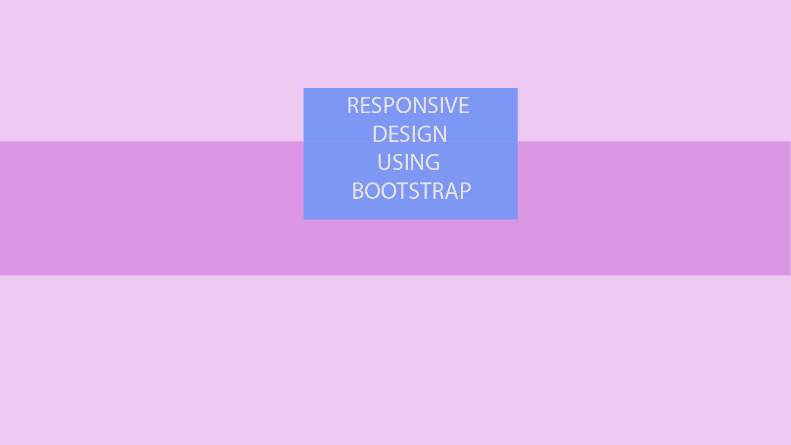
我需要创建一个响应页面使用引导按位置 div 在页面的中心,就像在下面提到的布局。

680923 次浏览

引导程序5的更新

更简单的垂直网格与柔性箱对齐

@import url('https://cdnjs.cloudflare.com/ajax/libs/bootstrap/5.0.1/css/bootstrap.min.css');
html,
body {
height: 100%
}
<div class="h-100 d-flex align-items-center justify-content-center">
<div style="background:red">
TEXT
</div>
</div>

引导程序4的解决方案

更简单的垂直网格与柔性箱对齐

@import url('https://maxcdn.bootstrapcdn.com/bootstrap/4.0.0-alpha.6/css/bootstrap.min.css');
html,
body {
height: 100%
}
<div class="h-100 d-flex align-items-center justify-content-center">
<div style="background:red">
TEXT
</div>
</div>

Bootstrap 3的解决方案

@import url('http://getbootstrap.com/dist/css/bootstrap.css');
html, body, .container-table {
height: 100%;
}
.container-table {
display: table;
}
.vertical-center-row {
display: table-cell;
vertical-align: middle;
}
<script src="http://cdnjs.cloudflare.com/ajax/libs/twitter-bootstrap/2.1.0/bootstrap.min.js"></script>


<div class="container container-table">
<div class="row vertical-center-row">
<div class="text-center col-md-4 col-md-offset-4" style="background:red">TEXT</div>
</div>
</div>

这是一个在所有屏幕尺寸中居中的水平和垂直 div 的简单示例。

JsFiddle

HTML :

<div class="container" id="parent">
<div class="row">
<div class="col-lg-12">text
<div class="row ">
<div class="col-md-4 col-md-offset-4" id="child">TEXT</div>
</div>
</div>
</div>
</div>

CSS :

#parent {
text-align: center;
}
#child {
margin: 0 auto;
display: inline-block;
background: red;
color: white;
}

答得好,波洛诺,我只是随便玩玩,然后我找到了一个更好的解决方案。 CSS 将保持不变,即:

html, body, .container {
height: 100%;
}
.container {
display: table;
vertical-align: middle;
}
.vertical-center-row {
display: table-cell;
vertical-align: middle;
}

但对于 HTML:

<div class="container">
<div class="vertical-center-row">
<div align="center">TEXT</div>
</div>
</div>

这就够了。

这里有一些简单的 CSS 规则,可以将任何 div 放在中间

.centered {
position: fixed;
top: 50%;
left: 50%;
transform: translate(-50%, -50%);
}

Https://css-tricks.com/quick-css-trick-how-to-center-an-object-exactly-in-the-center/

没有展示台,没有自举,我宁愿这样做

<div class="container container-table">
<div class="row vertical-center-row">
<div class="text-center col-md-4 col-md-offset-4" style="background:red">TEXT</div>
</div>
</div>


html, body, .container-table {
height: 100%;
}
.container-table {
width:100vw;
height:150px;
border:1px solid black;
}
.vertical-center-row {
margin:auto;
width:30%;
padding:63px;
text-align:center;


}

Http://codepen.io/matoeil/pen/pbbwgq

CSS:

html,
body {
height: 100%;
}


.container {
height: 100%;
display: flex;
justify-content: center;
align-items: center;
}

HTML:

<div class="container">
<div>
example
</div>
</div>

例子小提琴

我认为使用 bootstrap 完成布局的最简单方法是这样的:

<section>
<div class="container">
<div class="row">
<div align="center">
<div style="max-width: 200px; background-color: blueviolet;">
<div>
<h1 style="color: white;">Content goes here</h1>
</div>
</div>
</div>
</div>
</div>

我所做的只是添加了一些 div 层,这样我就可以将 div 居中,但是因为我没有使用百分比,所以需要指定将 div 居中的最大宽度。

您可以使用同样的方法来居中多个列,只需要添加更多的 div 图层:

<div class="container">
<div class="row">
<div align="center">
<div style="max-width: 400px; background-color: blueviolet;">
<div class="col-md-12 col-sm-12 col-xs-12" style="background-color: blueviolet;">
<div class="col-md-8 col-sm-8 col-xs-12" style="background-color: darkcyan;">
<h1 style="color: white;">Some content</h1>
</div>
<div class="col-md-4 col-sm-4 col-xs-12" style="background-color: blue;">
<p style="color: white;">More content</p>
</div>
</div>
</div>
</div>
</div>
</div>

注意: 我为 md,sm 和 xs 添加了一个12列的 div,如果你不这样做,第一个背景颜色的 div (在这个例子中是“ blueviolite”)将会折叠,你可以看到子 div,但是看不到背景颜色。

引导程序4的更新

现在,Bootstrap 4是柔性箱,垂直对齐更容易。给定一个全高度的柔性箱 div,只有我们 my-auto的顶部和底部利润率均匀..。

<div class="container h-100 d-flex justify-content-center">
<div class="jumbotron my-auto">
<h1 class="display-3">Hello, world!</h1>
</div>
</div>

Http://codeply.com/go/ayrab3tjsd/bootstrap-4-vertical-center


引导程序4中的垂直中心

引导程序4

让孩子们横向居中,使用 bootstrap-4类

justify-content-center

把孩子们竖着放在中间,使用 bootstrap-4类

 align-items-center

但是记住不要忘了使用 d-flex 类 这是一个引导4实用类,就像这样

<div class="d-flex justify-content-center align-items-center" style="height:100px;">
<div class="bg-primary">MIDDLE</div>
</div>

注意: 确保添加 bootstrap-4实用程序,如果这段代码不起作用

对于 Bootstrap 4.3.1的实际版本,请使用

风格

<link rel="stylesheet" href="https://stackpath.bootstrapcdn.com/bootstrap/4.3.1/css/bootstrap.min.css">
<style type="text/css">
html, body {
height: 100%;
}
</style>

密码

<div class="h-100 d-flex justify-content-center">
<div class="jumbotron my-auto">
<!-- example content -->
<div class="alert alert-success" role="alert">
<h4 class="alert-heading">Title</h4>
<p>Desc</p>
</div>
<!-- ./example content -->
</div>
</div

你不需要在 CSS 中改变任何东西,你可以直接在类中写这个,你会得到结果。

<div class="col-lg-4 col-md-4 col-sm-4 container justify-content-center">
<div class="col" style="background:red">
TEXT
</div>
</div>

enter image description here

虽然不是最好的办法,但还是可行的

<div class="container-fluid h-100">
<div class="row h-100">
<div class="col-lg-12"></div>
<div class="col-lg-12">
<div class="row h-100">
<div class="col-lg-4"></div>
<div class="col-lg-4 border">
This div is in middle
</div>
<div class="col-lg-4"></div>
</div>


</div>
<div class="col-lg-12"></div>
</div>


</div>

最简单的方法是在两边各加一栏,如下所示:

  <div class="row form-group">


<div class="col-3"></div>


<ul class="list-group col-6">
<li class="list-group-item active">Yuvraj Patil</li>
</ul>


<div class="col-3"></div>
</div>

试试这个,例如,我使用了一个固定的高度。我认为它不会影响响应场景。

<html lang="en">
<head>
<link rel="stylesheet" href="https://stackpath.bootstrapcdn.com/bootstrap/4.3.1/css/bootstrap.min.css">
</head>
<body>
<div class="d-flex justify-content-center align-items-center bg-secondary w-100" style="height: 300px;">
<div class="bg-primary" style="width: 200px; height: 50px;"></div>
</div>
</body>
</html>

在 Bootstrap 4中,使用:

<div class="d-flex justify-content-center">...</div>

您还可以根据需要更改位置:

<div class="d-flex justify-content-start">...</div>
<div class="d-flex justify-content-end">...</div>
<div class="d-flex justify-content-between">...</div>
<div class="d-flex justify-content-around">...</div>

参考资料 给你

body{
height: 100vh;
}
.container{
height: 100%;
}
<link href="https://stackpath.bootstrapcdn.com/bootstrap/4.4.1/css/bootstrap.min.css" rel="stylesheet"/>


<div class="container text-center d-flex align-items-center justify-content-center">
<div>
<div>
<h1>Counter</h1>
</div>
<div>
<span>0</span>
</div>
<div>
<button class="btn btn-outline-primary">Decrease</button>
<button class="btn btn-danger">Reset</button>
<button class="btn btn-outline-success">Increase</button>
</div>
</div>
</div>

你也可以这样做。

为了使一个 div 居中,需要将内部引导程序的三个类名分配到一个 div 中: ml-0 mr-0 mx-auto

看看下面这个简单的例子,它是如何被集中的

<div class="bg-primary w-50 ml-0 mr-0 mx-auto text-center">
Center
</div>