我想在一个 div 没有 javascript和 没有背景图像中心一个 img。
下面是一些示例代码
<div> <img src="/happy_cat.png"/> </div>
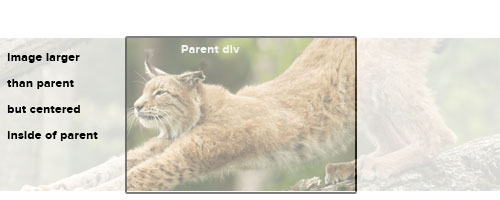
期望的结果。(忽略不透明度等,只注意位置)。
我知道这可以很容易做背景图片,但这不是我的选择。我也可以使用 javascript,但它似乎是一个非常笨拙的方式来实现这一点。
谢谢!
杰克
这总是有点棘手,有很多解决方案。我发现最好的解决方案是这样的。这使它在垂直和水平方向上都处于中心。
CSS
#container { height: 400px; width: 400px; } .image { background: white; width: 100%; height: 100%; position: relative; overflow: hidden; } .left { width: 100px; height: 100%; z-index: 2; background: white; top: 0px; position: absolute; left: 0px; } .right { width: 100px; height: 100%; z-index: 2; position: absolute; background: white; top: 0px; right: 0px; } .image img { margin: auto; display: block; }
HTML
<div id="container"> <div class="image"> <div class="left"></div> <div class="right"></div> <img width="500" src="https://www.google.com.au/images/srpr/logo11w.png" /> </div>
看小提琴
略有不同的技术: 小提琴
只需初始化您的图像的位置如下。
HTML:
<div> <img id="img" src="/happy_cat.png"/> </div>
CSS:
#img { left: 0; right: 0; }
或者用 margin: auto;来看
margin: auto;
这是水平对齐用的。为了使它垂直对齐,你可以先做 display: table-cell;到你的 <div>,然后是 vertical-align: middle;,但这不是一个好的做法,因为你的 <div>不是一个表。
display: table-cell;
<div>
vertical-align: middle;
谢谢大家的帮助。 < Strike > 我认为这在 CSS 中是不可能实现的。
我将转向 jQuery 解决方案。
我本来打算放弃一个 CSS 解决方案,但看起来它可以做到(见接受的答案)。这是我要用的 JS 解决方案。
var $img = $('img'), w = $img.width(); $img.css({marginLeft: -w});
还有附带的 CSS
img{ position:absolute; left:50%; }
这个怎么样:
.img { position: absolute; left: 50%; top: 50%; -webkit-transform: translateY(-50%) translateX(-50%); }
这里假设父 div 的位置是相对的。我觉得如果你想要。相对定位而非绝对定位。只需删除 position: absolute和改变上/左 margin-top和 margin-left。
position: absolute
margin-top
margin-left
你可能想添加浏览器支持与 transform,-moz-transform等。
transform
-moz-transform
我知道这是旧的,但我也想出了一个纯 CSS 解决方案非常类似于上述。
.parent { float: left; position: relative; width: 14.529%; // Adjust to your needs } .parent img { margin: auto; max-width: none; // this was needed for my particular instance position: absolute; top: 11px; right: -50%; bottom: 0; left: -50%; z-index: 0; }
老问题,新答案:
当图像大于包装 div 时,文本对齐: 居中或边距: auto 将不起作用。但是,如果图像较小,那么解决绝对定位或负左边距将产生怪异的效果。
因此,当实际上图像大小事先并不知道(就像在 CSM 上一样) ,它可能比包装 div 大或小时,有一个优雅的 CSS3解决方案可以满足所有需求:
div { display: flex; justify-content: center; height: 400px; /* or other desired height */ overflow: hidden; } img { flex: none; /* keep aspect ratio */ }
注意,根据样式表中的其他规则,您可能需要将 width: auto 和/或 max-width: none 附加到 img。