IOS7圆框按钮

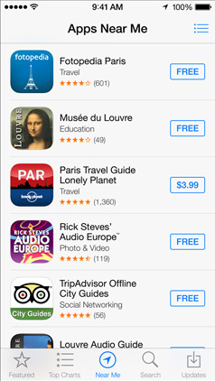
IOS 应用程序商店有一个蓝色圆框按钮,用于购买/下载应用程序。

在我的应用程序,你可以下载额外的内容,我想有一个类似的按钮,只是因为它看起来熟悉的用户。

如果你不知道,我的意思是: 这些按钮,像“ $3.99”

enter image description here

这怎么可能?

67333 次浏览

For simple border like you described, use the answer from Dima using CALAyer.

If you want more, e.g a rounded rectangle with gradient then use this approach as base:

Create a custom View which draws a rounded rectangle and place it over the button. Use the search function here to search for draw rounded rectangle. The drawing works by drawing 4 arcs with defined radius (corners) and 4 straight lines.


FTR, here's how you make a UIView with the correct iOS7 rounded corners, per Alex and Brian.

I'm pretty sure that CGPathCreateWithRoundedRect does not give you the "new" rounded corners. You have to use bezierPathWithRoundedRect for the "new" corners.

#import "UIViewWithIOS7RoundedCorners.h"
@implementation UIViewWithIOS7RoundedCorners
-(void)drawRect:(CGRect)rect
{
// for a filled shape...


UIBezierPath* path =
[UIBezierPath bezierPathWithRoundedRect:self.bounds cornerRadius:4];
[[UIColor blueColor] setFill];
[path fill];


// for just a border...


int thickness=2;
UIBezierPath* path =
[UIBezierPath bezierPathWithRoundedRect:
CGRectInset(self.bounds, thickness/2, thickness/2)
cornerRadius: 4];
path.lineWidth = thickness;
[[UIColor blueColor] setStroke];
[path stroke];
}


@end
// ps don't forget to set .backgroundColor=[UIColor clearColor]
// perhaps in initWithCoder/initWithFrame

enter image description here

enter image description here

Hope it helps someone

You can manipulate the CALayer of your button to do this pretty easily.

// assuming you have a UIButton or more generally a UIView called buyButton


buyButton.layer.cornerRadius = 2;
buyButton.layer.borderWidth = 1;
buyButton.layer.borderColor = [UIColor blueColor].CGColor;
// (note - may prefer to use the tintColor of the control)

you can tweak each of those to get the color and border effect you want.

You will also have to add an import in any file you want to use CALayers

#import <QuartzCore/QuartzCore.h>

For standard iOS control elements like UIButton, UILabel, you should use the UIView tintColor property:

buyButton.layer.borderColor = buyButton.tintColor.CGColor;

If you are a big fan of using storyboards for your UI design with iOS.. you can set the corner radius (and whichever other parameters as mentioned in dima's answer -- although unfortunately not the color, since it's a CGColor and Apple presently does not have that option in the popup) in the identity inspector->user defined runtime attributes in storyboard as shown here:

enter image description here

bonus: you use runtime attributes for UIButton placeholder text color (see here) and to change fonts of UILabel, UITextField and UIButton as well (see here)

I have implemented the AppStore style button here for your reference: ASButton.m

and the project is here

Hope to help :]

To extend @abbood 's excellent answer, it is actually possible to set the border color and background color of a view's layer from IB, but it requires a little prep work to do so.

I've created a custom category on NSView, CALayer+setUIColor.h.

The that sets border colors only has one method, setBorderUIColor. It takes a UIColor as an input, fetches the UIColor's underlying NSColor, and applies that color to the view's layer.

Then, in IB, you just add a user defined runtime attribute like this:

KeyPath layer.borderUIColor Type color Value The desired color.

At runtime the system invokes your method, passing in the UIColor that's defined in IB. The category gets the CGColor from the UIColor and applies it to the layer.

You can see this in a working project in a github project of mine called

RandomBlobs

I've also done the same thing for setting a layer's background color property, but not in the above project.

And for the swift version of Duncan C's extension of abbood's answer:

extension CALayer {
var borderUIColor: UIColor? {
get {
if let borderColor = borderColor {
return UIColor(CGColor: borderColor)
}
return nil
}
set {
borderColor = newValue?.CGColor ?? nil
}
}
}

With Swift 5.1 / iOS 13, you can create a subclass of UIButton in order to have a custom button that will look like the blue rounded border button in iOS AppStore app.

The following code shows how to manage properly the tint color (when the button appears behind the dimmed view of a UIAlertController), the title's color, the highlighted background color, the border's style, the border's color and the content insets.

CustomButton.swift:

import UIKit


class CustomButton: UIButton {


override init(frame: CGRect) {
super.init(frame: frame)
setProperties()
}


required init?(coder aDecoder: NSCoder) {
super.init(coder: aDecoder)
setProperties()
}


func setProperties() {
// Set the layer's properties
layer.borderColor = tintColor?.cgColor
layer.borderWidth = 1
layer.cornerRadius = 4


// Set colors for title's states
setTitleColor(tintColor, for: .normal)
setTitleColor(.white, for: .highlighted)


// Add some margins between the title (content) and the border
contentEdgeInsets = UIEdgeInsets(top: 5, left: 10, bottom: 5, right: 10)
}


override var isHighlighted: Bool {
didSet {
// Toggle the background color according to button's highlighted state
backgroundColor = super.isHighlighted ? tintColor : nil
}
}


override func tintColorDidChange() {
super.tintColorDidChange()


// When the tint color is changed by the system (e.g. when the button appears below the dimmed view of a UIAlertController), we have to manually update border color and title's text color
layer.borderColor = tintColor?.cgColor
setTitleColor(tintColor, for: .normal)
}


}

ViewController.swift:

import UIKit


class ViewController: UIViewController {


override func viewDidLoad() {
super.viewDidLoad()


view.backgroundColor = .secondarySystemBackground


let button = CustomButton()
button.setTitle("Normal", for: .normal)
button.setTitle("Highlighted", for: .highlighted)
button.addTarget(self, action: #selector(presentAlert(_:)), for: .touchUpInside)
view.addSubview(button)


// auto layout
button.translatesAutoresizingMaskIntoConstraints = false
button.centerXAnchor.constraint(equalTo: view.centerXAnchor).isActive = true
button.topAnchor.constraint(equalTo: view.topAnchor, constant: 100).isActive = true
}


/// Present alert when button is tapped
@objc func presentAlert(_ sender: UIButton) {
let alertController = UIAlertController(title: "Title", message: "Message", preferredStyle: .alert)
let alertAction = UIAlertAction(title: "OK", style: .default)
alertController.addAction(alertAction)
present(alertController, animated: true, completion: nil)
}


}

The images below show how the custom button will appear in normal state, when the system tinColor is changed (behind the dimmed view of a UIAlertController) and in highlighted state.

enter image description here