How to position two elements side by side using CSS

I want to position a paragraph to the right of an <iframe> of a Google map.

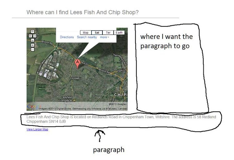
I do not know how to show my code, so here is a screenshot of what I want:

297294 次浏览

You can use float:left to align div in one line.

Fiddle

You can float the elements (the map wrapper, and the paragraph), or use inline-block on both of them.

Just use the float style. Put your google map iframe in a div class, and the paragraph in another div class, then apply the following CSS styles to those div classes(don't forget to clear the blocks after float effect, to not make the blocks trouble below them):

css

.google_map{
width:55%;
margin-right:2%;
float: left;
}
.google_map iframe{
width:100%;
}
.paragraph {
width:42%;
float: left;
}
.clearfix{
clear:both
}

html

<div class="google_map">
<iframe></iframe>
</div>
<div class="paragraph">
<p></p>
</div>
<div class="clearfix"></div>

Put the iframe inside the <p> and make the iframe CSS

float:left;

display:inline-block;

give your boxes the class foo (or whatever) and add the css

.foo{
float: left;
}

For your iframe give an outer div with style display:inline-block, And for your paragraph div also give display:inline-block

HTML

<div class="side">
<iframe></iframe>
</div>
<div class="side">
<p></p>
</div>

CSS

.side {
display:inline-block;
}

Like this

.block {
display: inline-block;
vertical-align:top;
}

JSFiddle Demo

Use either float or inline elements:

Example JSBIN

HTML:

<!DOCTYPE html>
<html>
<head>
<meta charset=utf-8 />
<title>JS Bin</title>
</head>
<body>
<div>float example</div>
<div><div style="float:left">Floating left content</div><div>Some content</div></div>
<div>inline block example</div>
<div><div style="display:inline-block">Some content</div><div style="display:inline-block">Next content</div></div>
</body>
</html>

You have two options, either float:left or display:inline-block.

Both methods have their caveats. It seems that display:inline-block is more common nowadays, as it avoids some of the issues of floating.

Read this article http://designshack.net/articles/css/whats-the-deal-with-display-inline-block/ or this one http://www.vanseodesign.com/css/inline-blocks/ for a more in detail discussion.

Wrap the iframe in a class, float that left.

The paragraph with then be forced up and to the right as long as there is room for it. Then set your paragraph to display:inline-block, and add some left margin to tidy it up.

<div class="left">
<img src="http://lorempixel.com/300/300" /> <!--placeholder for iframe-->
</div>
<p>Lorem Paragraph Text</p>


.left { float: left; }
p { display: inline-block; margin-left: 30px;  }

Here's a fiddle: http://jsfiddle.net/4DACH/

None of these solutions seem to work if you increase the amount of text so it is larger than the width of the parent container, the element to the right still gets moved below the one to the left instead of remaining next to it. To fix this, you can apply this style to the left element:

position: absolute;
width: 50px;

And apply this style to the right element:

margin-left: 50px;

Just make sure that the margin-left for the right element is greater than or equal to the width of the left element. No floating or other attributes are necessary. I would suggest wrapping these elements in a div with the style:

display: inline-block;

Applying this style may not be necessary depending on surrounding elements

Fiddle: http://jsfiddle.net/2b0bqqse/

You can see the text to the right is taller than the element to the left outlined in black. If you remove the absolute positioning and margin and instead use float as others have suggested, the text to the right will drop down below the element to the left

Fiddle: http://jsfiddle.net/qrx78u20/

You can simply use a div to make a container and display: flex; to make the content appear side-by-side like this:

.splitscreen {
display: flex;
}


.splitscreen .left,
.splitscreen .right {
flex: 1;
}
<div class="splitscreen">
<div class="left">
Content
</div>


<div class="right">
Content
</div>
</div>