如果我有一个带有按钮的无线电组:
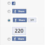
... 如何在选择选项中只显示图像而不是按钮?
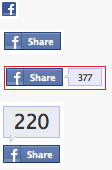
你可以使用CSS。
HTML(仅供演示,可自定义)
<div class="button"> <input type="radio" name="a" value="a" id="a" /> <label for="a">a</label> </div> <div class="button"> <input type="radio" name="a" value="b" id="b" /> <label for="b">b</label> </div> <div class="button"> <input type="radio" name="a" value="c" id="c" /> <label for="c">c</label> </div> ...
CSS
input[type="radio"] { display: none; } input[type="radio"]:checked + label { border: 1px solid red; }
jsFiddle
保持单选按钮隐藏,在点击图像时,使用JavaScript选择它们,并设置图像的样式,使其看起来像选中的。这是加价
<div id="radio-button-wrapper"> <span class="image-radio"> <input name="any-name" style="display:none" type="radio"/> <img src="..."> </span> <span class="image-radio"> <input name="any-name" style="display:none" type="radio"/> <img src="..."> </span> </div>
和JS
$(".image-radio img").click(function(){ $(this).prev().attr('checked',true); })
span.image-radio input[type="radio"]:checked + img{ border:1px solid red; }
<label>
display:none
visibility:hidden
+
alt
/* HIDE RADIO */ [type=radio] { position: absolute; opacity: 0; width: 0; height: 0; } /* IMAGE STYLES */ [type=radio] + img { cursor: pointer; } /* CHECKED STYLES */ [type=radio]:checked + img { outline: 2px solid #f00; }
<label> <input type="radio" name="test" value="small" checked> <img src="https://via.placeholder.com/40x60/0bf/fff&text=A" alt="Option 1"> </label> <label> <input type="radio" name="test" value="big"> <img src="https://via.placeholder.com/40x60/b0f/fff&text=B" alt="Option 2"> </label>
不要忘记添加一个类到你的标签,在CSS中使用类代替。
下面是使用<i>元素和::after伪元素的高级版本:
<i>
::after
.
body{color:#444;font:100%/1.4 sans-serif;} /* CUSTOM RADIO & CHECKBOXES http://stackoverflow.com/a/17541916/383904 */ .rad, .ckb{ cursor: pointer; user-select: none; -webkit-user-select: none; -webkit-touch-callout: none; } .rad > input, .ckb > input{ /* HIDE ORG RADIO & CHECKBOX */ position: absolute; opacity: 0; width: 0; height: 0; } /* RADIO & CHECKBOX STYLES */ /* DEFAULT <i> STYLE */ .rad > i, .ckb > i{ display: inline-block; vertical-align: middle; height: 16px; transition: 0.2s; box-shadow: inset 0 0 0 8px #fff; border: 1px solid gray; background: gray; } .rad > i { width: 16px; border-radius: 50%; } .ckb > i { width: 25px; border-radius: 3px; } .rad:hover > i{ /* HOVER <i> STYLE */ box-shadow: inset 0 0 0 3px #fff; background: gray; } .rad > input:focus + i { /* FOCUS <i> STYLE */ outline: 1px solid blue; } .rad > input:checked + i{ /* (RADIO CHECKED) <i> STYLE */ box-shadow: inset 0 0 0 3px #fff; background: orange; } /* CHECKBOX */ .ckb > input + i::after{ content: ""; display: block; height: 12px; width: 12px; margin: 2px; border-radius: inherit; transition: inherit; background: gray; } .ckb > input:focus + i { outline: 1px solid blue; } .ckb > input:checked + i::after{ /* (RADIO CHECKED) <i> STYLE */ margin-left: 11px; background: orange; }
<label class="rad"> <input type="radio" name="rad1" value="a"> <i></i> Radio 1 </label> <label class="rad"> <input type="radio" name="rad1" value="b" checked> <i></i> Radio 2 </label> <br> <label class="ckb"> <input type="checkbox" name="ckb1" value="a" checked> <i aria-hidden="true"></i> Checkbox 1 </label> <label class="ckb"> <input type="checkbox" name="ckb2" value="b"> <i aria-hidden="true"></i> Checkbox 2 </label>
小心!此解决方案仅支持css。
我建议你利用CSS3来做到这一点,用CSS3规则隐藏默认情况下输入单选按钮:
.options input{ margin:0;padding:0; -webkit-appearance:none; -moz-appearance:none; appearance:none; }
几天前我只是举了个例子。
下面是一个基于示例的简单jQuery UI解决方案:
http://jqueryui.com/button/#radio
修改代码:
<!doctype html> <html lang="en"> <head> <meta charset="utf-8"> <title>jQuery UI Button - Radios</title> <link rel="stylesheet" href="//code.jquery.com/ui/1.11.3/themes/smoothness/jquery-ui.css"> <script src="//code.jquery.com/jquery-1.10.2.js"></script> <script src="//code.jquery.com/ui/1.11.3/jquery-ui.js"></script> <link rel="stylesheet" href="/resources/demos/style.css"> <script> $(function() { $( "#radio" ).buttonset(); }); </script> </head> <body> <form> <div id="radio"> <input type="radio" id="radio1" name="radio"><label for="radio1"><img src="image1.gif" /></label> <input type="radio" id="radio2" name="radio" checked="checked"><label for="radio2"><img src="image2.gif" /></label> <input type="radio" id="radio3" name="radio"><label for="radio3"><img src="image3.gif" /></label> </div> </form> </body> </html>
jQueryUI负责图像背景,这样您就知道选中了哪个按钮。
注意:如果你想通过Javascript将按钮设置为选中或未选中,你必须调用refresh函数:
$('#radio3').prop('checked', true).button("refresh");
这里有一个非常简单的例子
input[type="radio"]{ display:none; } input[type="radio"] + label { background-image:url(http://www.clker.com/cliparts/c/q/l/t/l/B/radiobutton-unchecked-sm-md.png); background-size: 100px 100px; height: 100px; width: 100px; display:inline-block; padding: 0 0 0 0px; cursor:pointer; } input[type="radio"]:checked + label { background-image:url(http://www.clker.com/cliparts/M/2/V/6/F/u/radiobutton-checked-sm-md.png); }
<div> <input type="radio" id="shipadd1" value=1 name="address" /> <label for="shipadd1"></label> value 1 </div> <div> <input type="radio" id="shipadd2" value=2 name="address" /> <label for="shipadd2"></label> value 2 </div>
演示:http://jsfiddle.net/La8wQ/2471/
这个例子基于这个技巧:https://css-tricks.com/the-checkbox-hack/
我在chrome、firefox和safari浏览器上进行了测试
通过使用标签和span元素,可以将图像放置在单选按钮的位置。
<div class="customize-radio"> <label>Favourite Smiley</label><br> <label for="hahaha"> <input type="radio" name="smiley" id="hahaha"> <span class="haha-img"></span> HAHAHA </label> <label for="kiss"> <input type="radio" name="smiley" id="kiss"> <span class="kiss-img"></span> Kiss </label> <label for="tongueOut"> <input type="radio" name="smiley" id="tongueOut"> <span class="tongueout-img"></span> TongueOut </label> </div>
单选按钮应该隐藏,
.customize-radio label > input[type = 'radio'] { visibility: hidden; position: absolute; }
图像可以在span标签中给出,
.customize-radio label > input[type = 'radio'] ~ span{ cursor: pointer; width: 27px; height: 24px; display: inline-block; background-size: 27px 24px; background-repeat: no-repeat; } .haha-img { background-image: url('hahabefore.png'); } .kiss-img{ background-image: url('kissbefore.png'); } .tongueout-img{ background-image: url('tongueoutbefore.png'); }
点击单选按钮改变图像,在输入标签中添加选中状态,
.customize-radio label > input[type = 'radio']:checked ~ span.haha-img{ background-image: url('haha.png'); } .customize-radio label > input[type = 'radio']:checked ~ span.kiss-img{ background-image: url('kiss.png'); } .customize-radio label > input[type = 'radio']:checked ~ span.tongueout-img{ background-image: url('tongueout.png'); }
如果你有任何疑问,请参考下面的链接,因为我已经从下面的博客中采取了解决方案, http://frontendsupport.blogspot.com/2018/06/cool-radio-buttons-with-images.html < / p >
只是用一个类来隐藏一些…基于https://stackoverflow.com/a/17541916/1815624
/* HIDE RADIO */ .hiddenradio [type=radio] { position: absolute; opacity: 0; width: 0; height: 0; } /* IMAGE STYLES */ .hiddenradio [type=radio] + img { cursor: pointer; } /* CHECKED STYLES */ .hiddenradio [type=radio]:checked + img { outline: 2px solid #f00; }
<div class="hiddenradio"> <label> <input type="radio" name="test" value="small" checked> <img src="http://placehold.it/40x60/0bf/fff&text=A"> </label> <label> <input type="radio" name="test" value="big"> <img src="http://placehold.it/40x60/b0f/fff&text=B"> </label> </div> <div class=""> <label> <input type="radio" name="test" value="small" checked> <img src="http://placehold.it/40x60/0bf/fff&text=A"> </label> <label> <input type="radio" name="test" value="big"> <img src="http://placehold.it/40x60/b0f/fff&text=B"> </label> </div>
$spinTime: 3; html, body { height: 100%; } * { user-select: none; } body { display: flex; flex-direction: column; align-items: center; justify-content: center; font-family: 'Raleway', sans-serif; font-size: 72px; input { display: none; + div > span { display: inline-block; position: relative; white-space: nowrap; color: rgba(#fff, 0); transition: all 0.5s ease-in-out; span { display: inline-block; position: absolute; left: 50%; text-align: center; color: rgba(#000, 1); transform: translateX(-50%); transform-origin: left; transition: all 0.5s ease-in-out; &:first-of-type { transform: rotateY(0deg) translateX(-50%); } &:last-of-type { transform: rotateY(0deg) translateX(0%) scaleX(0.75) skew(23deg,0deg); } } } &#fat:checked ~ div > span span { &:first-of-type { transform: rotateY(0deg) translateX(-50%); } &:last-of-type { transform: rotateY(0deg) translateX(0%) scaleX(0.75) skew(23deg,0deg); } } &#fit:checked ~ div > span { margin: 0 -10px; span { &:first-of-type { transform: rotateY(90deg) translateX(-50%); } &:last-of-type { transform: rotateY(0deg) translateX(-50%) scaleX(1) skew(0deg,0deg); } } } + div + div { width: 280px; margin-top: 10px; label { display: block; padding: 20px 10px; text-align: center; transition: all 0.15s ease-in-out; background: #fff; border-radius: 10px; box-sizing: border-box; width: 48%; font-size: 64px; cursor: pointer; &:first-child { float: left; box-shadow: inset 0 0 0 4px #1597ff, 0 15px 15px -10px rgba(darken(#1597ff, 10%), 0.375); } &:last-child { float: right; } } } &#fat:checked ~ div + div label { &:first-child { box-shadow: inset 0 0 0 4px #1597ff, 0 15px 15px -10px rgba(darken(#1597ff, 10%), 0.375); } &:last-child { box-shadow: inset 0 0 0 0px #1597ff, 0 10px 15px -20px rgba(#1597ff, 0); } } &#fit:checked ~ div + div label { &:first-child { box-shadow: inset 0 0 0 0px #1597ff, 0 10px 15px -20px rgba(#1597ff, 0); } &:last-child { box-shadow: inset 0 0 0 4px #1597ff, 0 15px 15px -10px rgba(darken(#1597ff, 10%), 0.375); } } } } <input type="radio" id="fat" name="fatfit"> <input type="radio" id="fit" name="fatfit"> <div> GET F<span>A<span>A</span><span>I</span></span>T </div> <div> <label for="fat">🍕</label> <label for="fit">💪🏼</label> </div>
这对我来说很管用:
input[type="radio"] { margin-right: 1em; appearance: none; width: 12px; height: 12px; background-image: url("checkbox_off.gif"); } input[type="radio"]:checked { background-image: url("checkbox_on.gif"); }