使用 CSS td 宽度绝对值,位置

请看这个 JSFIDDLE

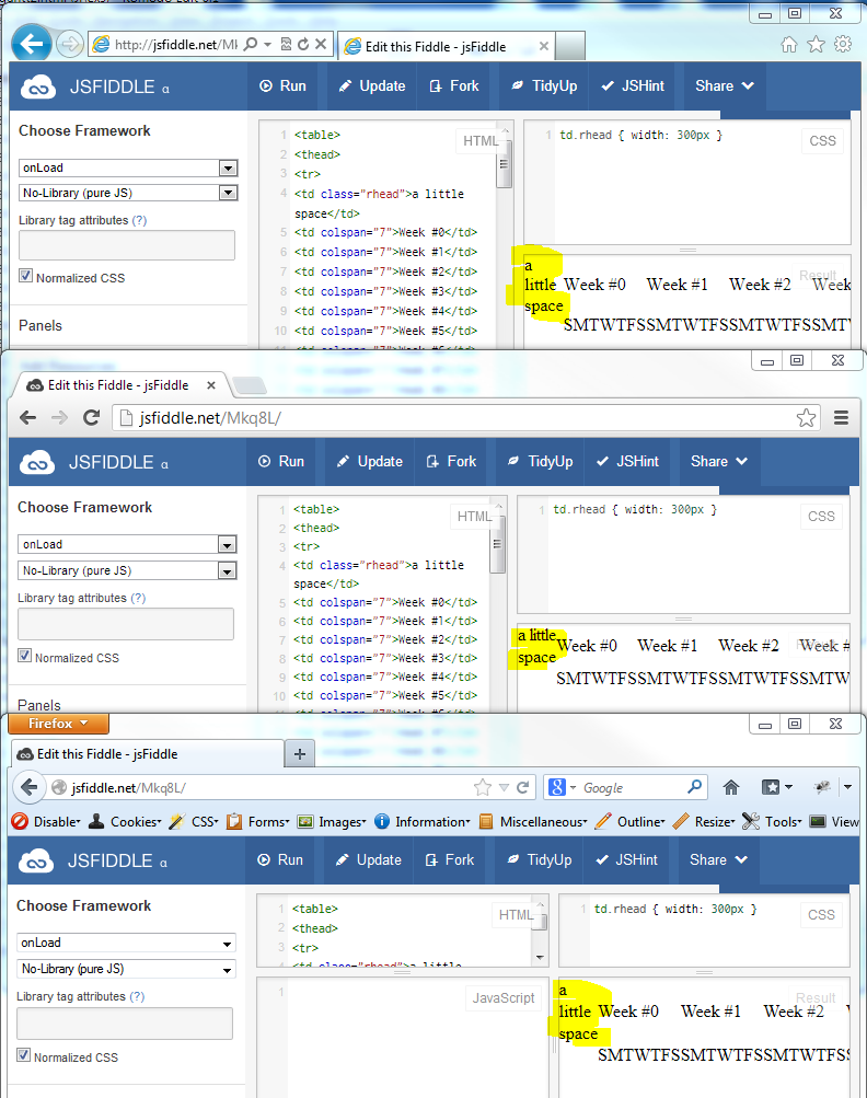
td.rhead { width: 300px; }

为什么 CSS 的宽度不起作用?

<table>
<thead>
<tr>
<td class="rhead">need 300px</td>
<td colspan="7">Week #0</td>
<td colspan="7">Week #1</td>
<!-- etc..-->
</tr>
<tr>
<td class="rhead"></td>
<td>S</td><td>M</td><td>T</td><td>W</td><td>T</td><td>F</td><td>S</td>
<!-- etc... -->
</tr>
<thead>
</table>

此外,位置: 固定,绝对等对 td 宽度有什么影响,如果有的话?我要找的不仅仅是解决问题的理由。我希望了解它是如何工作的。

td width is not 300px as desired

168896 次浏览

Try this it work.

<table>
<thead>
<tr>
<td width="300">need 300px</td>

The reason it doesn't work in the link your provided is because you are trying to display a 300px column PLUS 52 columns the span 7 columns each. Shrink the number of columns and it works. You can't fit that many on the screen.

If you want to force the columns to fit try setting:

body {min-width:4150px;}

see my jsfiddle: http://jsfiddle.net/Mkq8L/6/ @mike I can't comment yet.

You can also use:

.rhead {
width:300px;
}

but this will only with with some browsers, if I remember correctly IE8 does not allow this. Over all, It is safer to just put the width="" attribute in the <td> itself.

This may not be what you want to hear, but display: table-cell does not respect width and will be collapsed based on the width of the entire table. You can get around this easily just by having a display: block element inside of the table cell itself whose width you specify, e.g

<td><div style="width: 300px;">wide</div></td>

This shouldn't make much of a difference if the <table> itself is position: fixed or absolute because the position of the cells are all static relative to the table.

http://jsfiddle.net/ExplosionPIlls/Mkq8L/4/

EDIT: I can't take credit, but as the comments say you can just use min-width instead of width on the table cell instead.

The reason, is, because you did not specify the width of the table, and your whole bunch of td's are overflowing.

This for example, i've given the table a width of 5000px, which I thought would fit your requirements.

table{
width:5000px;
}

It is the exact same code you provided, which I merely added in the table width.

I believe what is happening, is because your TD's are way past the default table width. Which you could see, if you pull out about 45 of your td's in each tr, (i.e. the code you provided in your question, not jsfiddle) it works exactly fine

My crazy solution.)

$(document).ready(function() {
$("td").each(function(index) {
var htmlText = "<div style='width:300px;'>" + $(this).text() +"</div>";
$(this).html(htmlText);
});
});

Try to use

table {
table-layout: auto;
}

If you use Bootstrap, class table has table-layout: fixed; by default.

You're better off using table-layout: fixed

Auto is the default value and with large tables can cause a bit of client side lag as the browser iterates through it to check all the sizes fit.

Fixed is far better and renders quicker to the page. The structure of the table is dependent on the tables overall width and the width of each of the columns.

Here it is applied to the original example: JSFIDDLE, You'll note that the remaining columns are crushed and overlapping their content. We can fix that with some more CSS (all I've had to do is add a class to the first TR):

    table {
width: 100%;
table-layout: fixed;
}


.header-row > td {
width: 100px;
}


td.rhead {
width: 300px
}

Seen in action here: JSFIDDLE

If table width is for example 100%, try using a percentage width on td such as 20%.

Use table-layout property and the "fixed" value on your table.

table {
table-layout: fixed;
width: 300px; /* your desired width */
}

After setting up the entire width of the table, you can now setup the width in % of the td's.

td:nth-child(1), td:nth-child(2) {
width: 15%;
}

You can learn more about in on this link: http://www.w3schools.com/cssref/pr_tab_table-layout.asp

Wrap content from first cell in div e.g. like that:

HTML:

<td><div class="rhead">a little space</div></td>

CSS:

.rhead {
width: 300px;
}

Here is a jsfiddle.