我正在努力实现一些我确信应该比我正在做的更容易的事情!
我正在使用的骷髅响应框架,并已罚款,直到现在。
这是我想要达到的目标的示意图。
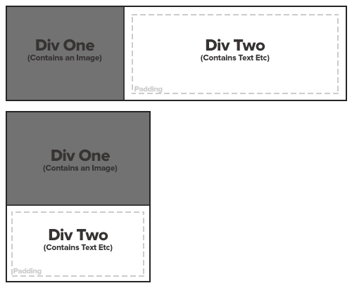
这将被放置在一个列中。一旦这些列的大小减小,我希望它能够按照图表中的第二个示例堆叠 div。我试过几种不同的方法,但总是出错。
我对 HTML/CSS 非常新,所以任何帮助都是感激的! 非常感谢!
这样做:
超文本标示语言
<div class="parent"> <div class="child"></div> <div class="child"></div> </div>
CSS
.parent{ width: 400px; background: red; } .child{ float: left; width:200px; background:green; height: 100px; }
这是工作 Jsfiddle。改变子 width多于 200px,他们将堆叠。
width
200px
浮动 div 可以帮助你实现目标。
例子
<div class="container"> <div class="content1 content"> </div> <div class="content2 content"> </div> </div>
.container{ width:100%; height:200px; background-color:grey; } .content{ float:left; height:30px; } .content1{ background-color:blue; width:300px; } .content2{ width:200px; background-color:green; }
放大页面以查看效果。
希望能有帮助。
使用一个基于 min-width的媒介,你可以获得类似于 http://jsbin.com/aruyiq/1/edit的东西
min-width
.wrapper { border : 2px dotted #ccc; padding: 2px; } .wrapper div { width: 100%; min-height: 200px; padding: 10px; -webkit-box-sizing: border-box; -moz-box-sizing: border-box; box-sizing: border-box; } #one { background-color: gray; } #two { background-color: white; } @media screen and (min-width: 600px) { .wrapper { height: auto; overflow: hidden; // clearing } #one { width: 200px; float: left; } #two { margin-left: 200px; } }
在我的示例中,断点是 600px,但是您可以根据需要调整它。
600px
你可以使用 CSS3媒体查询来完成这个任务,这样写:
.wrapper { border : 2px solid #000; overflow:hidden; } .wrapper div { min-height: 200px; padding: 10px; } #one { background-color: gray; float:left; margin-right:20px; width:140px; border-right:2px solid #000; } #two { background-color: white; overflow:hidden; margin:10px; border:2px dashed #ccc; min-height:170px; } @media screen and (max-width: 400px) { #one { float: none; margin-right:0; width:auto; border:0; border-bottom:2px solid #000; } }
<div class="wrapper"> <div id="one">one</div> <div id="two">two</div> </div>
看看这里有没有更多的 http://jsfiddle.net/cUCvY/1/
今天,这种事情可以通过使用 display:flex;来完成
display:flex;
Https://jsfiddle.net/suunyz3e/1435/
Html:
<div class="container flex-direction"> <div class="div1"> <span>Div One</span> </div> <div class="div2"> <span>Div Two</span> </div> </div>
Css:
.container{ display:inline-flex; flex-wrap:wrap; border:1px solid black; } .flex-direction{ flex-direction:row; } .div1{ border-right:1px solid black; background-color:#727272; width:165px; height:132px; } .div2{ background-color:#fff; width:314px; height:132px; } span{ font-size:16px; font-weight:bold; display: block; line-height: 132px; text-align: center; } @media screen and (max-width: 500px) { .flex-direction{ flex-direction:column; } .div1{ width:202px; height:131px; border-right:none; border-bottom:1px solid black; } .div2{ width:202px; height:107px; } .div2 span{ line-height:107px; } }
迟到总比不到好!
Https://getbootstrap.com/docs/4.5/layout/grid/
<div class="container"> <div class="row"> <div class="col-sm"> One of three columns </div> <div class="col-sm"> One of three columns </div> <div class="col-sm"> One of three columns </div> </div> </div>