引导:将输入与按钮对齐

为什么在引导中按钮和输入不能很好地对齐?

我尝试了一些简单的方法:

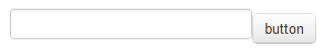
<input type="text"/><button class="btn">button</button>

该按钮比chrome/firefox中的输入低大约5px

enter image description here

450049 次浏览

推特引导4

在Twitter Bootstrap 4中,输入和按钮可以使用input-group-prependinput-group-append类进行对齐(参见https://getbootstrap.com/docs/4.0/components/input-group/#button-addons)

左侧分组按钮(prepend)

<div class="input-group mb-3">
<div class="input-group-prepend">
<button class="btn btn-outline-secondary" type="button">Button</button>
</div>
<input type="text" class="form-control">
</div>

右侧的分组按钮(追加)

<div class="input-group mb-3">
<input type="text" class="form-control">
<div class="input-group-append">
<button class="btn btn-outline-secondary" type="button">Button</button>
</div>
</div>

推特引导3

如@abimelex的回答所示,输入和按钮可以通过使用.input-group类来对齐(参见http://getbootstrap.com/components/#input-groups-buttons)

左侧的分组按钮

<div class="input-group">
<span class="input-group-btn">
<button class="btn btn-default" type="button">Go!</button>
</span>
<input type="text" class="form-control">
</div>

右侧的分组按钮

<div class="input-group">
<input type="text" class="form-control">
<span class="input-group-btn">
<button class="btn btn-default" type="button">Go!</button>
</span>
</div>

添加这个解决方案是为了让我的答案保持最新,但请在答案由@abimelex提供上投上你的票。


推特引导2

Bootstrap提供了一个.input-append类,它作为一个包装器元素,为你纠正这个问题:

<div class="input-append">
<input name="search" id="search"/>
<button class="btn">button</button>
</div>

正如@OleksiyKhilkevich在他的回答中指出的那样,通过使用.form-horizontal类,还有第二种方法来对齐inputbutton:

<div class="form-horizontal">
<input name="search" id="search"/>
<button class="btn">button</button>
</div>

的差异

这两个类之间的区别是.input-appendbutton放在input元素的前面(这样它们看起来就像附加的一样),而.form-horizontal将在它们之间放置一个空格。

——注——

为了允许inputbutton元素彼此相邻而没有空格,font-size.input-append类中被设置为0(这删除了inline-block元素之间的白色空格)。如果你想使用em%测量值覆盖默认值,这可能会对input元素中的字体大小产生不利影响。

只是提醒一下,似乎有一个特殊的CSS类叫做form-horizontal

Input-append还有另一个副作用,它将font-size降为0

使用.form-inline =将标签和内联块控件左对齐为紧凑布局

例如:http://jsfiddle.net/hSuy4/292/ < / p >

<div class="form-inline">
<input type="text">
<input type="button" class="btn" value="submit">
</div>

.form-horizontal =右对齐标签,并将它们浮动到左侧,使它们出现在同一行的控件,这是更好的2列形式布局。

(e.g.
Label 1: [textbox]
Label 2: [textbox]
: [button]
)

例子:http://twitter.github.io/bootstrap/base-css.html#forms

引导5

<div class="input-group">
<input type="text" class="form-control">
<button class="btn btn-outline-secondary" type="button">Go</button>
</div>

Bootstrap 3 &4

你可以使用输入组按钮属性将按钮直接应用到输入字段。

<div class="input-group">
<input type="text" class="form-control">
<span class="input-group-btn">
<button class="btn btn-default" type="button">Go!</button>
</span>
</div><!-- /input-group -->

更多的例子请看BS4BS5 Input-Group文档。

example for bs3 input group button

style="padding-top: 8px"

使用此选项在行中向上或向下移动div。对我来说很神奇。

我尝试了所有这些,最后我想分享一些变化。以下是对我有用的代码(请查看附件截图):

<div class="input-group">
<input type="text" class="form-control" placeholder="Search text">
<span class="input-group-btn" style="width:0;">
<button class="btn btn-default" type="button">Go!</button>
</span>
</div>

enter image description here

如果你想看到它工作,只需使用下面的代码在你的编辑器:

<html>
<head>
<link type='text/css' rel='stylesheet' href='https://maxcdn.bootstrapcdn.com/bootstrap/3.0.0/css/bootstrap.min.css' />
</head>
<body>
<div class="container body-content">
<div class="form-horizontal">
<div class="input-group">
<input type="text" class="form-control" placeholder="Search text">
<span class="input-group-btn" style="width:0;">
<button class="btn btn-default" type="button">Go!</button>
</span>
</div>
</div>
</div>
</body>
</html>

希望这能有所帮助。

<form class="form-inline">
<div class="form-group">
<label class="sr-only" for="exampleInputEmail3">Email address</label>
<input type="email" class="form-control" id="exampleInputEmail3" placeholder="Email">
</div>
<button type="submit" class="btn btn-default">Sign in</button>
</form>

我尝试了上面所有的代码,没有一个能解决我的问题。以下是对我有效的方法。我使用input-group-addon。

<div class = "input-group">
<span class = "input-group-addon">Go</span>
<input type = "text" class = "form-control" placeholder="you are the man!">
</div>

我也在为同样的问题而挣扎。我使用的引导类并不适合我。我想出了一个变通办法,如下所示:

<form action='...' method='POST' class='form-group'>
<div class="form-horizontal">
<input type="text" name="..."
class="form-control"
placeholder="Search People..."
style="width:280px;max-width:280px;display:inline-block"/>


<button type="submit"
class="btn btn-primary"
style="margin-left:-8px;margin-top:-2px;min-height:36px;">
<i class="glyphicon glyphicon-search"></i>
</button>
</div>
</form>

基本上,我重写了类“form-control”的显示属性,并使用其他样式属性来纠正大小和位置。

结果如下:

enter image description here

不是直接相关的,除非你有类似的代码,但我刚刚注意到一个奇怪的行为形成内联,bootstrap 3.3.7

我没有使用行和单元格,因为这是一个桌面项目,如果开始标记在表下面(在这种情况下):

<table class="form-inline">
<form>
<tr>

表单元素会堆叠起来。

开关和它正确排列。

<form>
<table class="form-inline">
<tr>

Safari 10.0.2和最新的Chrome浏览器没有任何区别。也许我的布局是错误的,但它不是很宽容。

引导4:

<div class="input-group">
<input type="text" class="form-control">
<div class="input-group-append">
<button class="btn btn-success" type="button">Button</button>
</div>
</div>

https://getbootstrap.com/docs/4.0/components/input-group/

输入浮点数为左。然后取下按钮,让它向右浮动。 当你需要一个以上的课程时,你可以clearfix。< / p >

<input style="width:65%;float:left"class="btn btn-primary" type="text" name="name">
<div style="width:8%;float:left">&nbsp;</div>
<button class="btn btn-default" type="button">Go!</button>
<div class="clearfix" style="margin-bottom:10px"> </div>